Last updated: 2nd May 2026
11 ‘About Us’ page examples that show E-E-A-T.
 By James Brockbank, Managing Director & Founder
Get weekly SEO insights straight to your inbox.
Sign up to outranked, our weekly SEO newsletter
Most about us pages suck.
In fact, I’d take a guess that yours probably does (sorry).
They’re often nothing more than a short blurb about a business that offers nothing of value.
And I want you to realise just how important this often-overlooked page is, to figure out why yours isn’t good enough, and to go off and build something better.
In fact, your site’s about us page is one of the easiest ways you can demonstrate E-E-A-T. And if sustainable SEO success is important to you (it should be), this is something you need to pay attention to.
You see, your About Us page is something that’s entirely in your control. It’s up to you how detailed it is, how much of your story you tell and how you use it to demonstrate why you should be trusted by those who don’t yet know you.
So why do so many brands settle for mediocre about-us pages that no one wants to read?
And if you realise yours does, in fact, suck, where can you get inspiration on what great looks like?
Keep reading to be convinced about why you should go away and overhaul your site’s about us page, why it’s a huge opportunity to demonstrate E-E-A-T and to see 12 examples of pages that, in my opinion, can inspire you to create something better and what great looks like.
Is your About Us page good enough?
Go ahead and open up your site’s About Us page.
Head to your top five competitors’ sites, find their About Us pages and make notes on what stands out on these. Especially things that demonstrate their Experience, Expertise, Authoritativeness and Trustworthiness (E-E-A-T).
Do this with the mindset of a user, not as their competitor.
What parts of the page would convince you that this business is trustworthy and an authority in its space?
Then ask yourself whether your own About Us page is good enough…
I’m going to guess not. But what you’ve now got is a list of notes on what your competitors are doing better than you. You can use these notes as you start to plan how to improve your own.
About Us pages are an unmissable opportunity to demonstrate E-E-A-T
Your About Us page is a great opportunity to demonstrate E-E-A-T, and if you’re not already taking advantage of this, consider this your sign to start thinking about it.
In fact, you can use your About Us page to showcase:
- Your brand’s story
- Your product and service offerings (an overview, you don’t want to cause cannibalisation)
- Trust factors and signals
- Your USPs
- Your standout statistics
- Your team
- Your awards, professional memberships, and industry accreditations
- Your reviews and testimonials (being sure to link to your dedicated Reviews page, if you have one)
- Your locations and offices
- Your contact information (again, linking to the main Contact Us page)
- Your clients, customers, and partners
- Your editorial policy and other relevant standards
On page 27 of Google’s Quality Rater Guidelines (QRGs), Google recommends using a site’s About Us page as a starting point for assessing whether it is a trustworthy source.
And we can take this as a strong signal of the importance of About Us pages for demonstrating E-E-A-T, and as justification for the effort required to make ours as comprehensive as possible and, above all else, to showcase that the business is trustworthy.
We can also look at an example that Google gives in the QRGs on page 74, which demonstrates high E-E-A-T.
Here’s the summary:
| High: Small Business 1
Local fish & chips restaurant |
|
This is an “about us” page on a restaurant website. This page provides information on when the restaurant opened and what visitors can expect. Other pages on the website provide information about the restaurant, including the address, menu, and other contact information, etc. The website is the go-to source for information about itself (Authoritative). The MC is high-quality (effort, original content unique to this site). |
And here’s the page cited as being high-quality…
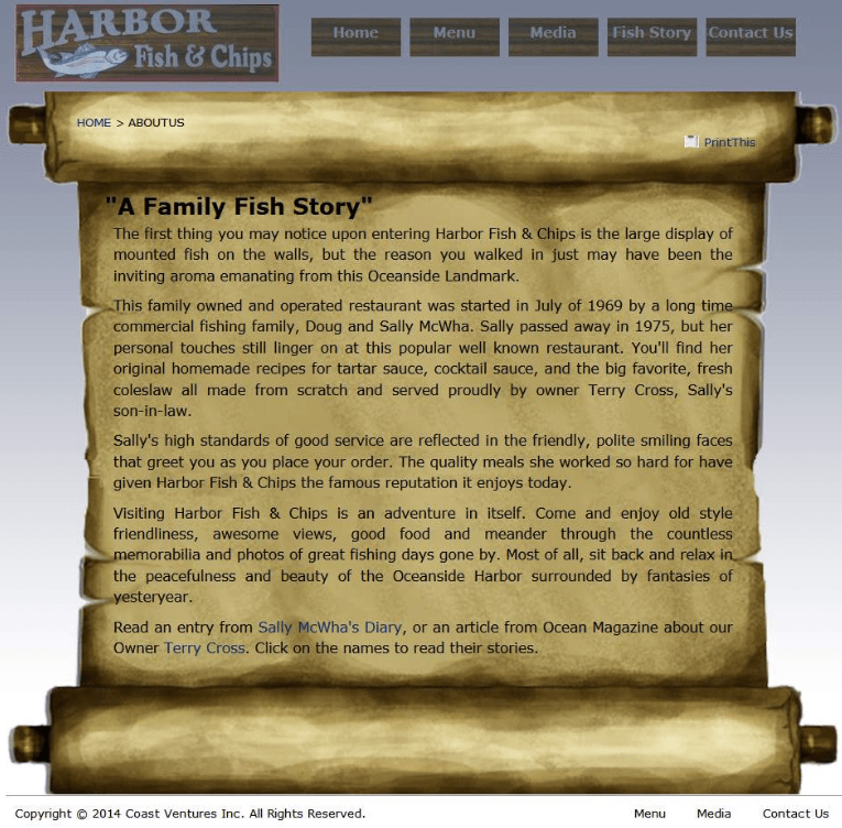
I’m going to go out on a limb and say that’s probably not what you were expecting, right? Right.
But what’s important is that this demonstrates high E-E-A-T in line with the page’s purpose. This is a local fish-and-chip restaurant, not a YMYL (Your Money or Your Life) business. And context is key here. A local restaurant isn’t expected to demonstrate E-E-A-T to the same level as a bank or company giving financial information, for example.
This page showcases a few key things:
- The business has been established since 1969
- It’s still operated by the founders’ son-in-law today
- Ocean Magazine has featured the owner, Terry Cross, showcasing third-party validation
For a local restaurant, this is sufficient to land a ‘high’ E-E-A-T rating.
Of course, this is just one example, but it’s a good one for helping us understand the importance of approaching E-E-A-T within the context of your own industry.
12 About Us page examples to inspire your own
Sometimes, it’s hard to figure out how to rework a page without ending up with version 1.1 of what you’ve already got.
And when your site’s about us page isn’t good enough to demonstrate E-E-A-T, you probably need to start thinking about it from scratch, rather than just making improvements to what’s live at the moment.
Rather than totally reinventing the wheel, though, it’s always useful to spend time looking over how other brands are approaching their pages, taking the standout parts from the ones that resonate with you the most, and using these as inspiration for how to significantly improve yours.
But the problem is that most About Us pages aren’t anything special. And this can make it hard to find inspiration and examples that offer anything that’s above average.
So I’ve put together a list of 12 About Us page examples that I use as reference points, time and time again.
Each of these pages sits proudly in my swipe file as inspiration for suggesting improvements to clients.
In my opinion, they’re some of the best About Us pages out there when it comes to demonstrating E-E-A-T, and there’s lots you can learn from these 11 examples.
For each example, you’ll learn what makes these so great at demonstrating E-E-A-T, and what makes them stand out in a sea of boring and bland about us pages.
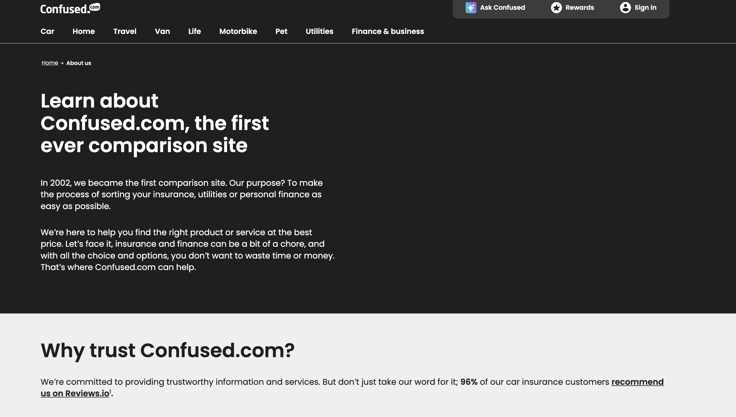
1. Confused.com
Confused.com’s About Us page is perhaps the one I refer to most when talking about what ‘great’ looks like, especially for YMYL brands.
In my opinion, there are few About Us pages that go into more detail than this, and after reading it, you’re left with absolutely no questions about who the business is, how it operates, and why it’s a trusted brand.
Here’s why Confused.com’s About Us page stands out:
- Straight away, the page aims to help users trust the brand, sharing three key reasons why this should be the case.
- There’s transparency around how Confused.com makes money (at a time when there’s too little clarity about how some sites make money, it’s brilliant to see this). This honesty is not just a general overview either; Confused.com breaks it down to the product level, which really helps build trust.
- It’s really easy to see how the brand is regulated and who owns the site. Again, this page is all about transparency.
- You can see who Confused.com’s experts are without clicking into another page, further helping to showcase that it’s genuine experts behind the content.
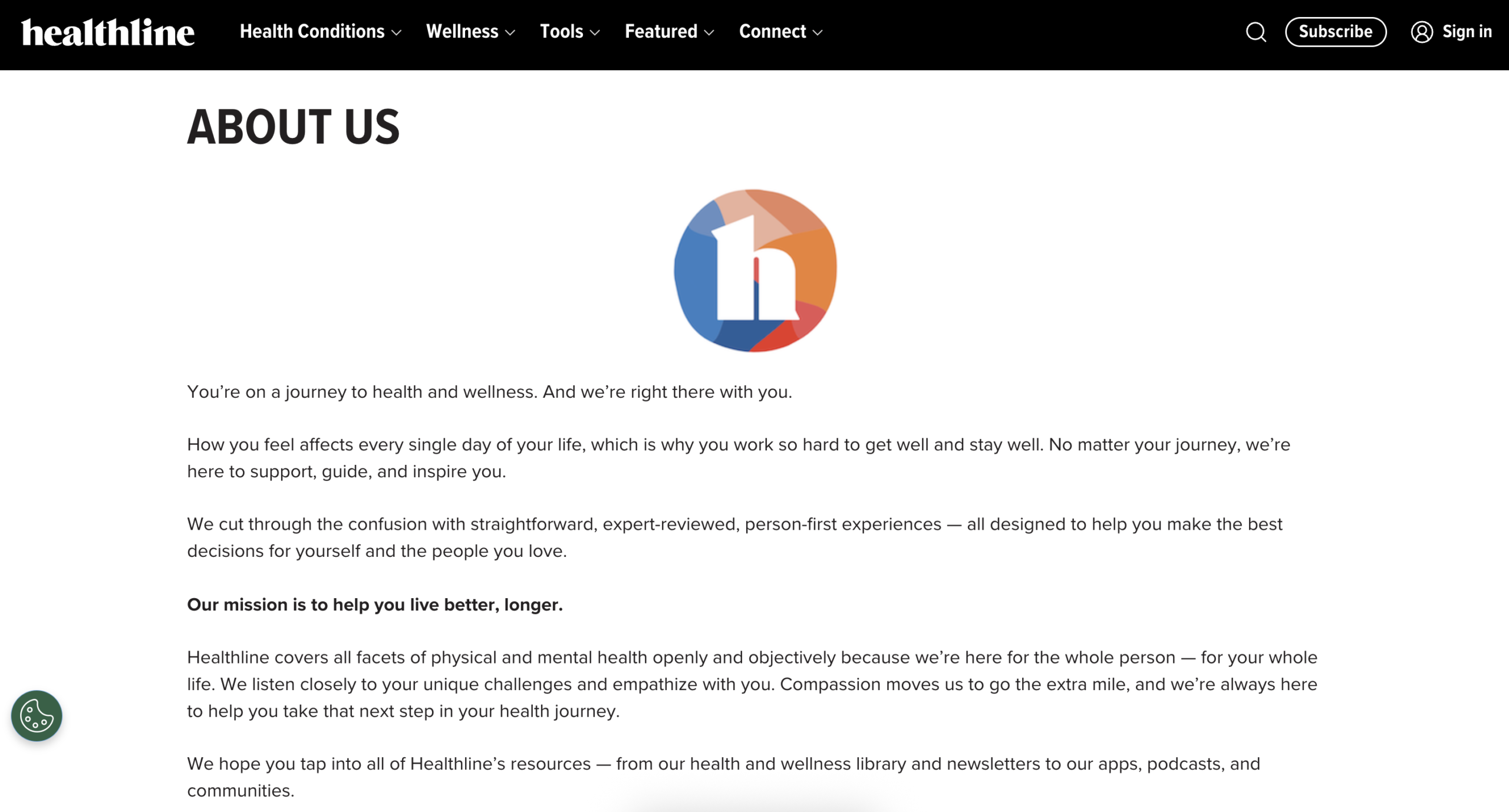
2. Healthline
There’s a reason many of us first became aware of the importance of E-E-A-T (then E-A-T) during Google’s Medic Update in 2018: healthcare and medical sites were hit the hardest.
Why? For not demonstrating sufficient E-A-T signals in many cases.
And for that reason, brands operating in this, or any other YMYL niche, need to pay close attention to how they’re demonstrating that their content is produced by experts and that they’re a trusted voice in the space.
Healthline, in my opinion, does a fantastic job of this, and its About Us page is one from which a lot can be learned.
Standout features of Healthline’s About Us page:
- It’s instantly clear how important Healthline is to a large community. 150 million each month, in fact. And what’s fantastic to see is the source of this, the brand’s Google Analytics from October 2022. Granted, this could be updated more frequently, but it’s transparent.
- The transparency around the site’s editorial policy and medical affairs team stands out. It’s easy to see that the site is powered by over 150 healthcare professionals and what their content standards are. Insight into how they use AI is also refreshing.
- Users can easily see the various communities Healthline runs for people with chronic conditions, their contact details, and the wealth of policies.
3. RenoFi
YMYL covers all types of ‘Your Money or Your Life’ industries, and finance plays a huge part in this. RenoFi is a disruptive fintech company transforming the US renovation loan industry.
And their About Us page does a great job at helping those who have probably never heard of the brand to trust them. In fact, it’s a great example to see how you don’t need fancy designs to create a page that demonstrates a high level of E-E-A-T.
Elements that make RenoFi’s page so great are:
- In the intro, users learn exactly what RenoFi does and, more importantly, that their team comprises expert loan originators. It’s this sort of information that Quality Raters are encouraged to look for.
- There’s clear information about the RenoFi Loan, a product most people haven’t heard of. But what’s maybe even more important is the clarity around the NCUA-insured credit unions RenoFi partners with, and that RenoFi has funded renovation projects worth over $1 billion.
- The RenoFi Story helps build trust and showcase the personal connection, explaining why the company was founded and the problem it set out to solve. Users want to connect with brands, and understanding their story goes a long way to helping this happen.
- Users can clearly see who Renofi’s founding team is and each team member’s NMLS number.
- The disclosures help to back up RenoFi’s credibility; they make it clear how the company makes money, who they can help and the company’s information.
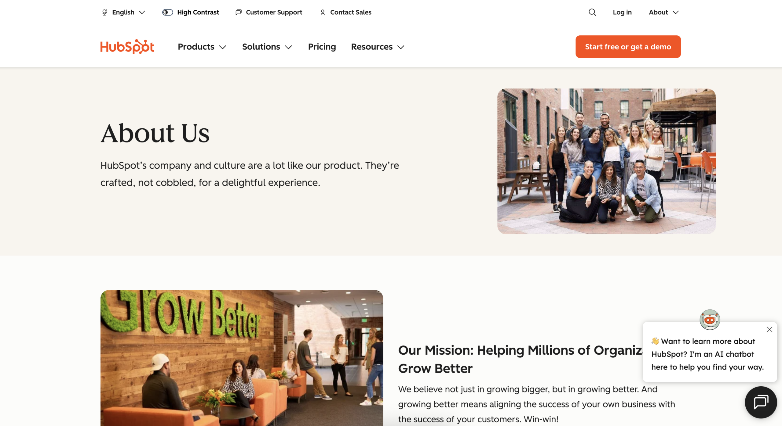
4. HubSpot
HubSpot is a brand pretty much every marketer is more than familiar with, and its About Us page is simple yet incredibly effective at demonstrating E-E-A-T.
And it’s the simple but personable format that does this so well.
Standout features of HubSpot’s About Us page:
- HubSpot’s mission is at the forefront of its About Us page, right alongside its two co-founders. People want to know who is behind a business, and this is a great way to showcase this.
- The brand’s story is one that many could only aspire to, but it’s not just told as a wall of text. Using video and the founders’ stories, straight from their mouths, takes this delivery to another level.
- What builds the most trust here is the data behind the brand’s community. By showcasing the stats behind HubSpot, it’s hard to ignore the influence that this company has on its customers. Using data is a definite way to build trust with your users, even if those numbers aren’t as large as HubSpot’s.
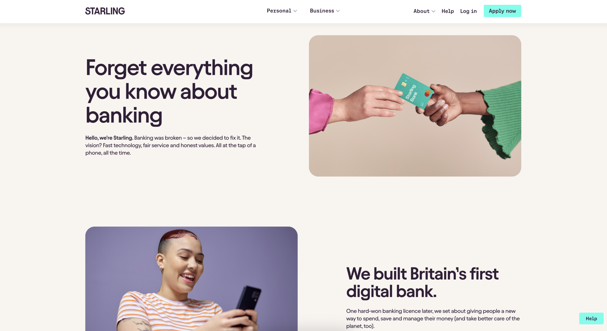
5. Starling Bank
Another example from a YMYL niche and one that builds an instant connection between users and the bank.
And again, we see data playing a role in demonstrating E-E-A-T, as well as a clear use of storytelling, which helps get the user on-side.
Here’s why Starling Bank’s About Us page ticks the boxes:
- It reads like a story, which is the perfect way to introduce a user to who they are, what they do, and why they’re trustworthy. Claims such as ‘Britain’s first digital bank’ are bold yet easily verifiable. It doesn’t take long to showcase that this bank is doing big things. Claims like this are a great way to get users on-side, especially when told as part of a story.
- Transparency around working at Starling, as well as their commitment to encouraging more women into finance, stand out here. It’s these ‘personal’ touches that go a long way to helping customers to connect right from the start.
- Showcasing who owns Starling leaves no questions unanswered, and the way this information is shared makes it easy to dive into the owners and the leadership team. Noticing a trend here? Transparency wins.
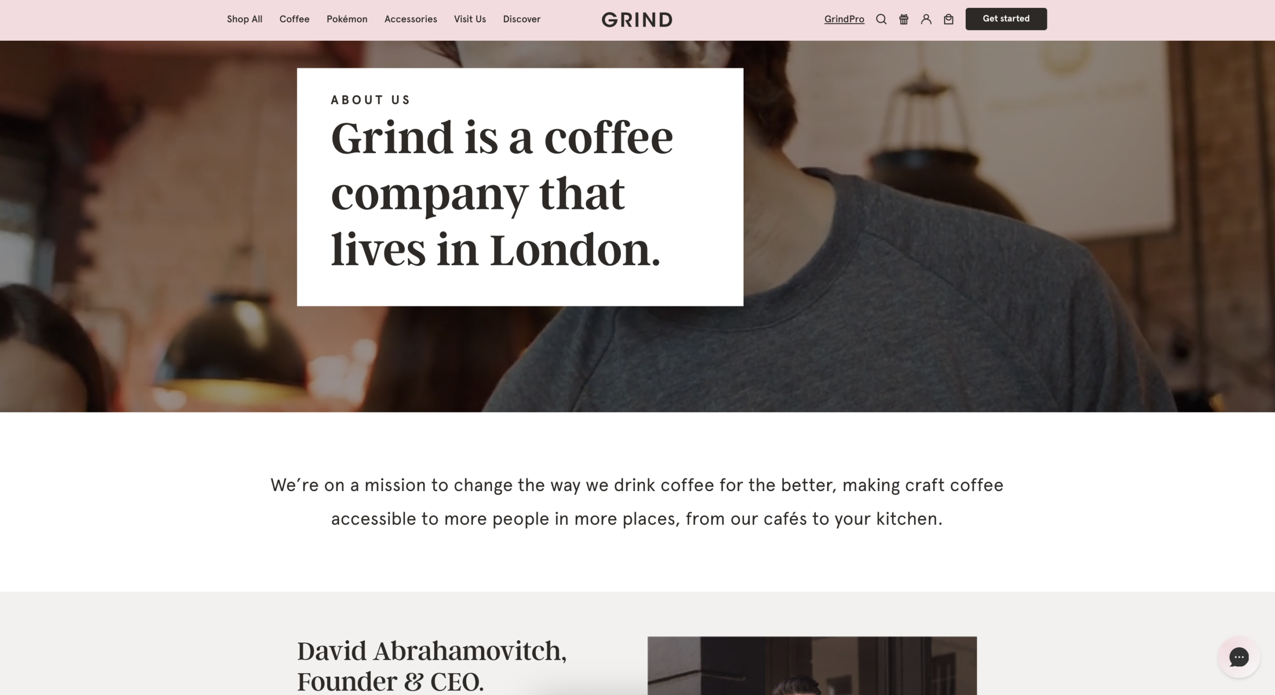
6. Grind
Grind is our first example here that steps away from YMYL and into eCommerce.
And it’s great to see how those businesses with a little less responsibility for their customers (in the sense of YMYL) go about demonstrating E-E-A-T. Of course, every business has a responsibility to build trust and look after its customers, but as we showed with Google’s own example, it takes less to demonstrate outside of YMYL.
Standout features of Grind’s About Us page:
- Grind does a lot to demonstrate its commitment to the planet and to doing good. To a group of consumers who care deeply about sustainability and green initiatives, this speaks directly to them.
- But what stands out most here is that over a quarter of a million reviews have an average rating of almost 5/5. It’s very hard to argue with so many positive reviews, and this goes a long way to building trust amongst target consumers (and search engines).
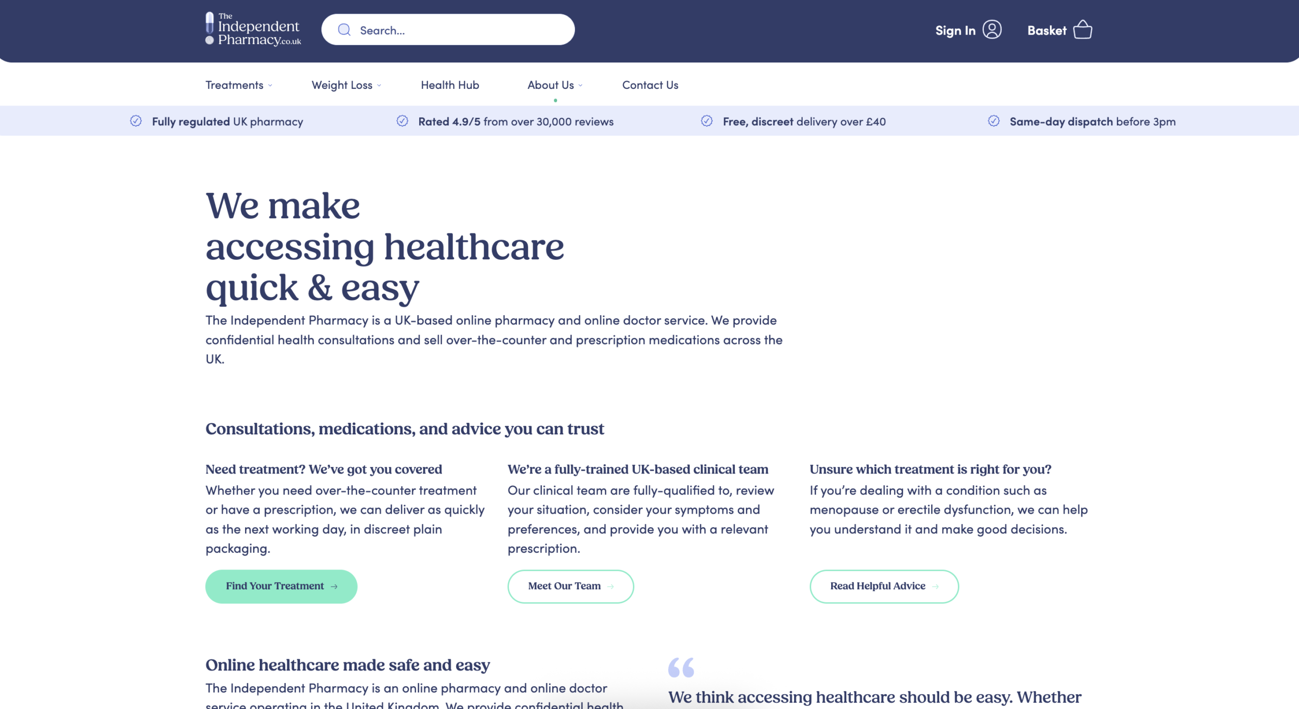
7. The Independent Pharmacy
Back to a YMYL niche, The Independent Pharmacy’s About Us page doubles down on showcasing that their site is run by experienced healthcare professionals and many more reasons why they can be trusted.
And let’s not forget that Trust is, by far, the most important E-E-A-T factor, according to Google.
The Independent Pharmacy’s About Us page is great because:
- The first claim on the page is that the company is run by experienced healthcare professionals, which users want to see, especially in a sector where expertise is so important. But E-E-A-T is not just about making claims, but backing them up, too.
- It’s easy to see who is behind the brand and why they set it up: to fight misinformation and address the state of online healthcare in 2013. Talk about getting the users on side.
- In terms of backing these claims, we can see links to The Independent Pharmacy’s memberships with regulatory bodies (which may be the biggest trust signal in this space) and even a link to report untrustworthy pharmacies. There’s plenty of evidence here that they’re doing their bit to stand up to those who aren’t trustworthy.
- It showcases the 8 qualified pharmacists with 150+ years of combined experience, alongside 19,000+ positive reviews, which, like with Grind, go a long way toward building trust
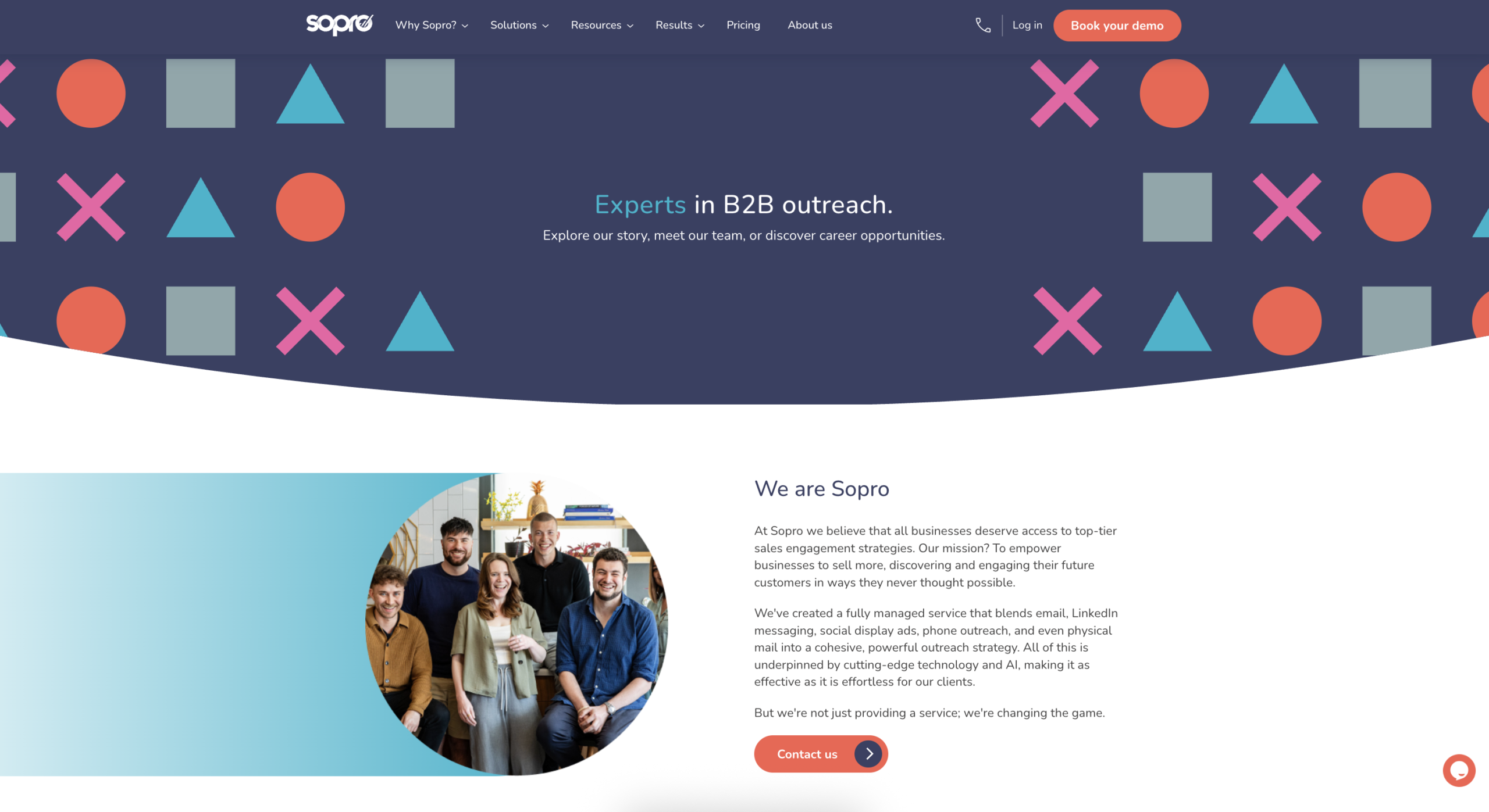
8. Sopro
B2B SEO is a tricky discipline, with more discerning audiences who typically take more time to weigh up their options, compare benefits, and critique providers.
Ultimately, this creates a situation in which brands need to work harder to earn the trust of prospective buyers, part of which includes clearly showcasing their credentials and merits online.
As an award-winning B2B SaaS brand, Sopro excels at this. It effectively communicates who, what, where, when, and why behind the brand, while remaining true to the unmistakably bold messaging style for which it’s known.
Here’s why Sopro’s About Us page is far more than so-so:
- The information is clear and upfront, with no messing about. Sopro states why the business exists, what its mission is, and how it works in three short paragraphs.
- The brand’s history is laid out simply and effectively in an easy-to-digest three-phase narrative. The origins, the evolution, and the now. We know SaaS buyers are busy and time-poor, so presenting a decade-long story with restraint is key.
- The numbers don’t lie, or so they say! And this is exactly what Sopro leans into. Brands can talk a big game about who they are and why they should be respected, but Sopro backs these claims with figures, proudly listing its number of clients, successful campaigns, outreach messages sent, and conversations started.
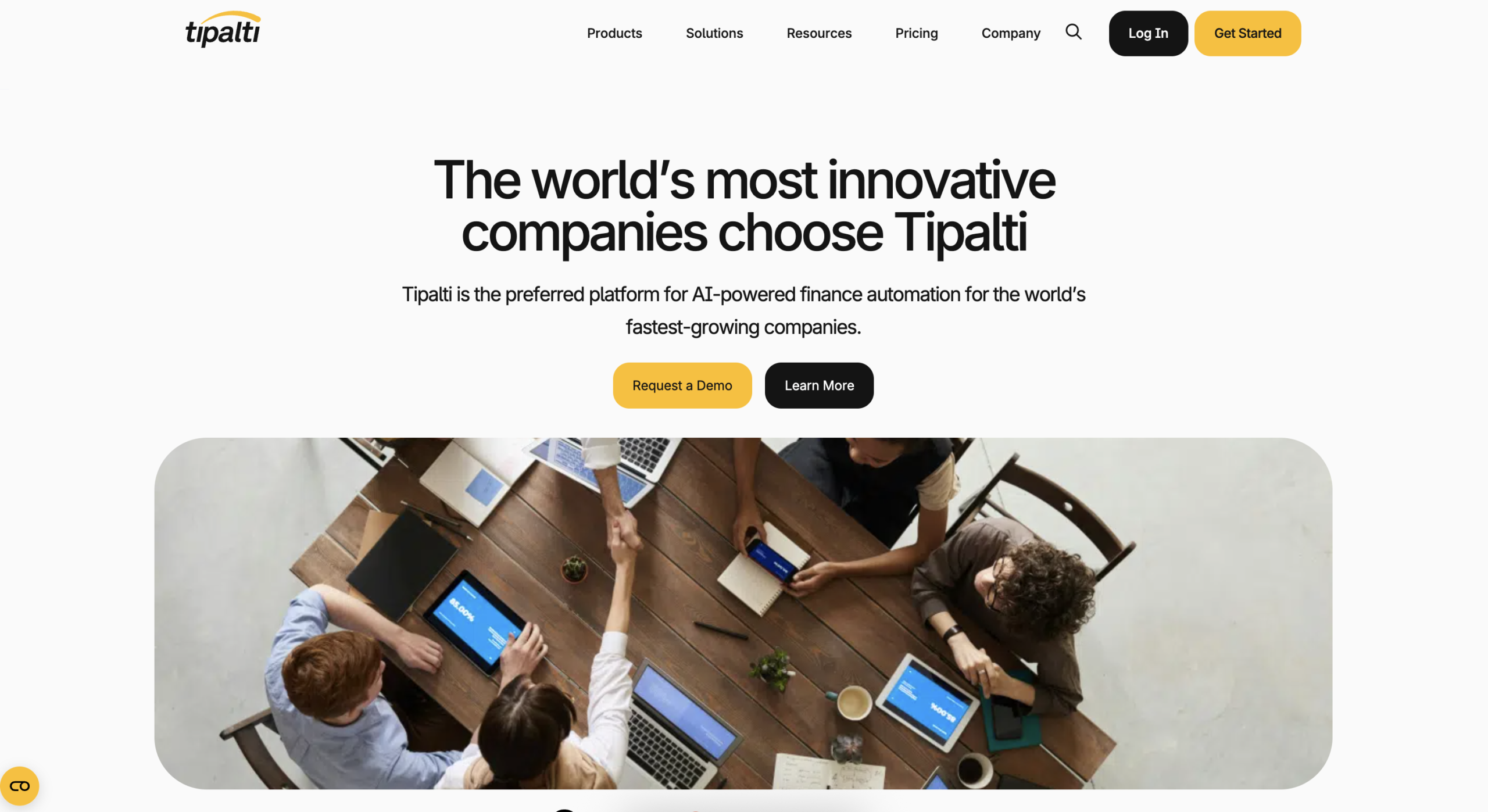
9. Tipalti
It’s not uncommon for tech companies to spend more time on their product pages than their About Us pages, often on the grounds that it’s the product that sells, not just the people.
But let’s remember that, for many companies, the investments they make in tech are significant, and a convincing About Us page plays a big part in their due diligence when working with people.
Tipalti is a brilliant example that oozes transparency and that tech companies can learn a lot from.
Standout features of Tipalti’s About Us page:
- People buy from people, that’s a fact, and by leading (almost) with the company’s leadership team, it’s easy to meet the people behind the brand. And as Google continues to double down on knowing who is behind content, doing so is recommended.
- Once again, data tells a big story, and one thing that stands out is that this is a brilliant way to build trust. After all, a company with more than 1,000 team members that’s processing more than $41 billion in payments is a big deal, right?
- The clients Tipalti works with include several well-known brands, and referencing them further builds trust. Don’t ignore the importance of associating yourself with your customers and clients.
- Not only that, but by showcasing clear milestones, it’s easy to take users along on the journey of learning the brand’s history.
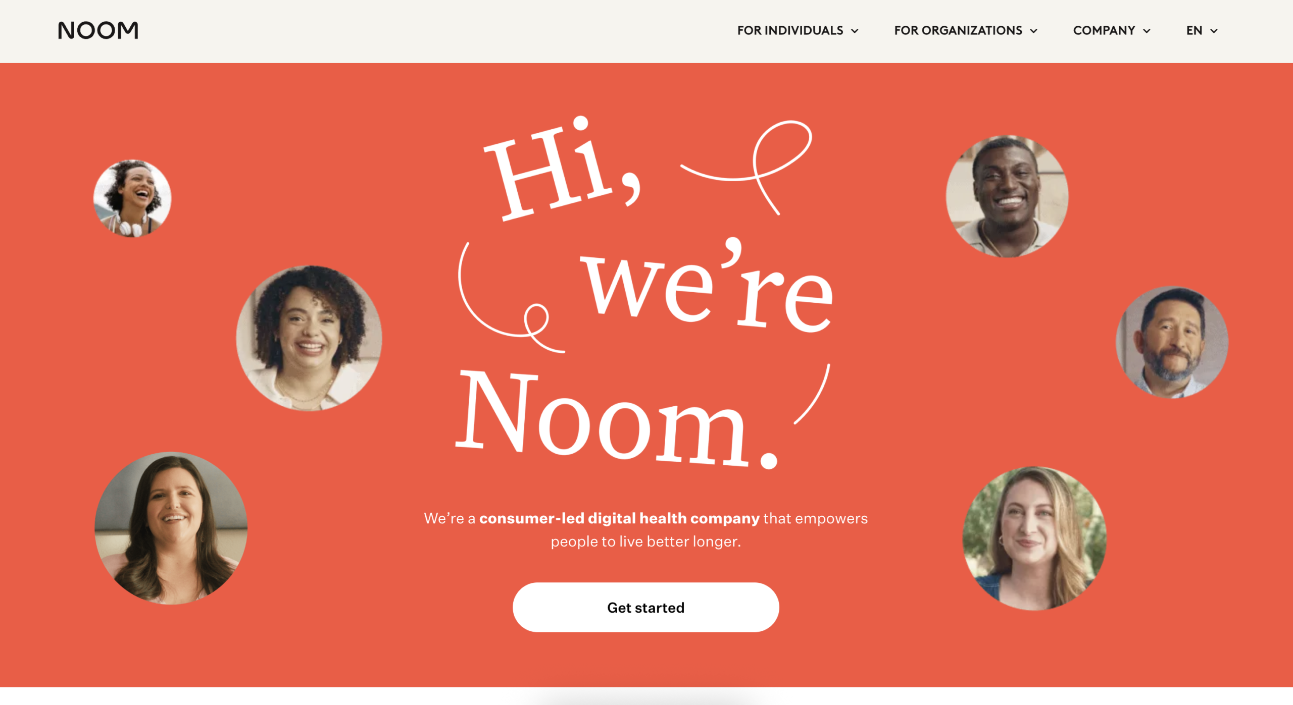
10. Noom
It’s perhaps no surprise that we’re seeing so many YMYL niche brands featured here, but the thinking is that if you can learn from those demonstrating E-E-A-T in these sectors, you’ll be inspired to do better in pretty much any industry.
Don’t forget that there’s nothing wrong with going above and beyond to demonstrate E-E-A-T, even in industries where it’s maybe not quite as critical as others.
These are the standout features of Noom’s About Us page:
- This is another example of a brand using video to tell its mission, and it’s for good reason. Video often provides a better way to tell a story than words alone, and it’s clear that some brands are quickly realising this offers a personal touch to gain buy-in and build trust with customers.
- The page does a fantastic job of selling the product and demonstrating that it’s backed by psychology, technology and human coaching. Talk about connecting with what people are looking for.
- Including testimonials on the page serves as proof from users, and the brand’s story adds much-needed value once again.
- The little things count too, though. See the links towards the bottom of the page? These make it really easy for users to view the brand’s press coverage earned via digital PR, career opportunities, and the latest scientific research. It’s references like this that can make all the difference in demonstrating why your users should trust you: validation from others.
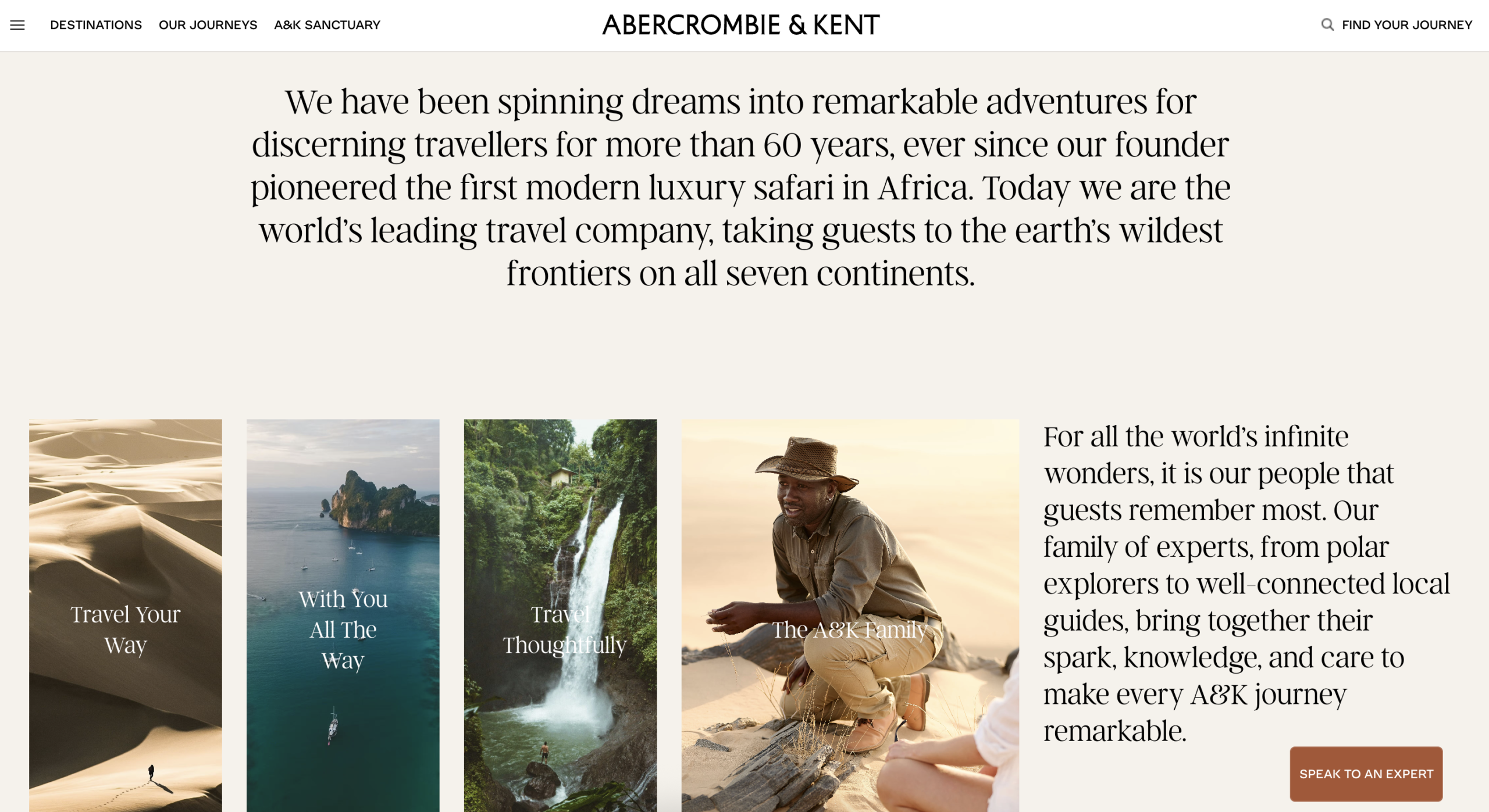
11. Abercrombie and Kent
On first glance, it looks like a simple, pretty basic About Us page. But it’s not.
Whilst the main About Us page here offers just a brief introduction to Abercrombie & Kent, you’ll see 12 links out to pages that expand on this and that, together, form part of this section of the site. Together, these do an awful lot to demonstrate E-E-A-T in an effective travel SEO strategy.
Abercrombie and Kent’s About Us page works so well because:
- It tells you pretty much everything you could ever want to know about the company, from its history to its team, awards, philanthropy and more. And it’s this breath of information that sets it apart from most of the competition.
- This example shows that you don’t need to be limited to a single page just because that’s how many brands choose to do it. Sometimes it makes more sense to split key information across multiple pages, and there’s absolutely nothing wrong with that. As we can see here, it can be really easy to pinpoint users to the information they’re looking for, and it all still builds trust.
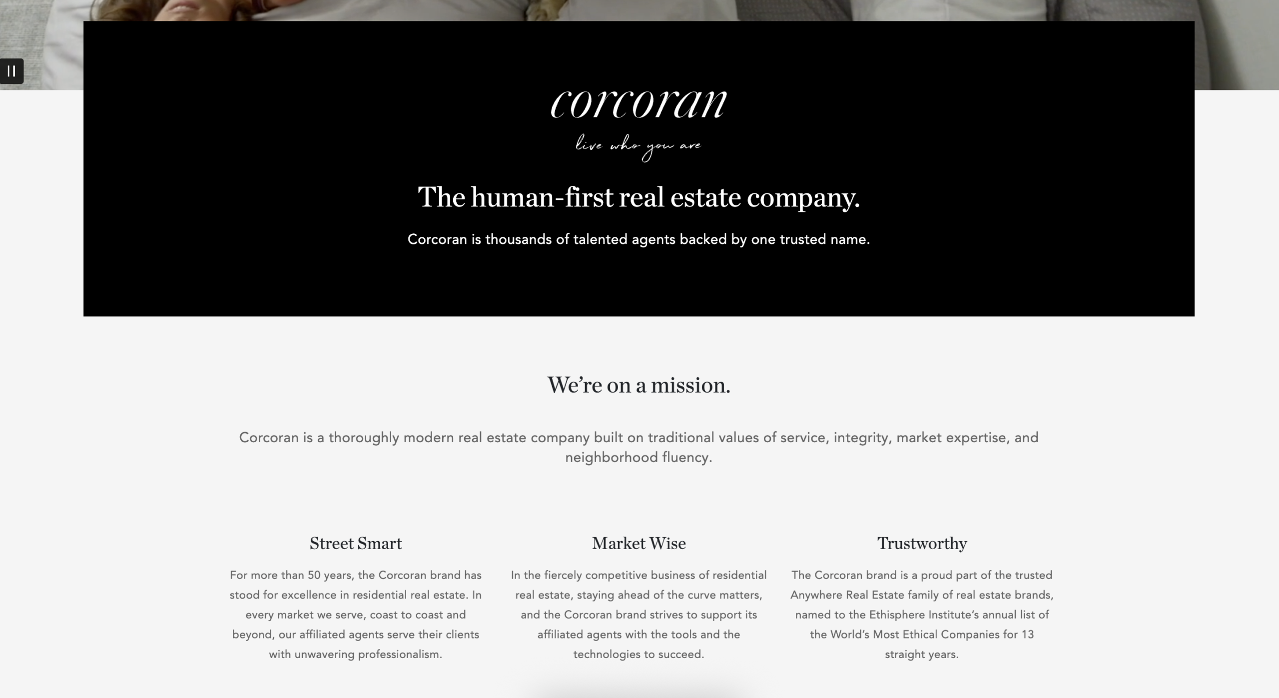
12. Corcoran
An About Page is your opportunity to tell your story, whatever you want that to be. And real estate company Corcoran has found the perfect way to do this.
Yes, it’s one of the more visual examples here, but it’s incredibly effective at doing what they’ve set out to do: showcase that they’re a human-first real estate company.
Here’s why Corcoran’s About Us page is great:
- Again, we see this About Us page opening with the brand’s mission. This is something we’ve seen recur across many of the examples here. Why? Because it’s the perfect way to introduce a brand to someone unfamiliar with it and share its purpose. What do we learn? That Corcoran is thousands of talented agents backed by one trusted name. Trust, trust, trust. That’s what it’s all about.
- Transparency around the brand’s leadership and executive teams goes a long way toward positioning yourself as a human-first brand, and they’re a key feature of this page, as is the story behind the company. History builds trust.
- The page ends with links to some of the brand’s standout pieces of press coverage, again showcasing the importance of backing up what you say with third-party validation. When you’ve got the press talking about you, and you shout about it yourself, it’s hard for people to ignore the trust signals it builds.
Don’t sleep on About Us pages when working to build E-E-A-T
If you’ve taken just one thing away from this guide, I hope it’s that your About Us page is a more important part of demonstrating E-E-A-T than you thought 20 (give or take) minutes ago.
And by taking the time to really understand what it takes to ‘do better’ in your industry and by building an About Us page that your competitors will turn to for inspiration, you can go above and beyond in demonstrating why your users should trust your site and brand.