
Most author pages suck.
Yep, just like most about us pages suck.
I’m going to take a pretty good guess that your author pages are little more than a standard template that shows your author’s name and a grid of their posts.
That, or that you don’t have any author pages at all, and are relying on a short byline underneath or alongside posts to showcase who the author is and what their experience and expertise is.
But that’s not good enough.
Author pages are one of the most important page types that your site can have, and I want to inspire you to do better.
Keep reading, and let me share some examples of what are, in my opinion, ones that brilliantly demonstrate E-E-A-T.
Are Your Author Pages Good Enough?
Go ahead and load up one of your sites blog posts or guides. One that clearly has an author assigned.
Ask yourself whether this single page tells you:
- Who the author is
- What their experience is
- What their areas of expertise are
- How to contact them / find them on social
- The posts they’ve authored
And this is as a bare minimum.
I’m going to take a guess your author pages don’t go into this much detail. But they should.
And now is the time to do something about this, and reconsider how important these pages actually are.
An Opportunity to Demonstrate E-E-A-T
Your site’s author pages are one of the best ways you can demonstrate on-page E-E-A-T signals at the author level.
(Take a read of our guide to E-E-A-T at the content, author and brand levels to learn more about what this means.)
You see, Google continues to double down on understanding who content has been authored by and whether that person has the experience and/or expertise required to be publishing on a given topic.
This starts by making it really easy to understand who is behind a piece of content and who they are.
The best way to do this?
Author pages.
They’re the absolute baseline of E-E-A-T.
And no, just adding a byline to the end of posts isn’t enough. You need standalone author pages.
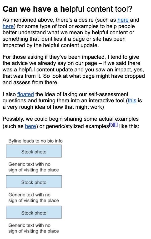
In fact, Google’s Danny Sullivan recently shared some insights on X about feedback he’d given to Google Engineers. One piece of feedback, specifically, talked about the potential for a ‘self-assessment questionnaire’ for sites negatively affected by updates.
One example? “Byline leads to no bio info…” and we can take this as further suggestion that these are something we should put effort into.
Create an Entity Home
When done right, you can also use author pages as an ‘entity home’ for your people.
This is the central source of truth used when trying to land and maintain a Personal Knowledge Panel.
You can read more about what this is and how to get a Personal Knowledge Panel in Kalicube’s guide, but one thing you need to know is that Google has recently expanded the number of Person entities by more than 20 times between May 2020 and September 2023.
This in itself gives us a pretty good indication that Google is working hard to understand the people behind a site better than ever.
In many cases, your author pages make the perfect entity home, so long as they’ve been built out with sufficient information.
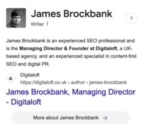
Take my own author page, as an example:

I’ve built this out as my own entity home, and am now seeing this used as the reference for the description for my own Personal Knowledge Panel:
The days of author pages showing nothing but the person’s name and their latest posts are over, and now is the time to double down on significantly improving these pages.
11 Author Page Examples to Inspire Your Own
I’ve rounded up 11 author page examples that brilliantly demonstrate E-E-A-T to inspire your own pages.
Each of these examples does a fantastic job of defining who the author is, what their background is and where else they can be found across the web.
Go grab a brew, grab a notepad and make some notes as you explore these awesome examples.
Nerdwallet
Nerdwallet is one of my favourite examples of an SEO success story, and there are many things they do very well. Their author pages are one of these things, and there’s a lot that we can learn from these.
In my opinion, they tick pretty much all the boxes of the perfect author page layout.

Standout Features of Nerdwallet’s Author Pages
NerdWallet’s author pages, analysed here using Kate Wood’s profile, are excellent demonstrations of E-E-A-T. Key features include:
- Job Title and a Summary of Expertise: Clearly stating the author’s role and areas of expertise, in this example, “Lead Writer | Homebuying, mortgages, homeownership”.
- Detailed Bio: Providing a comprehensive biography that includes the author’s background, experience, and even personal anecdotes. Kate’s bio, for instance, shares her journey from ‘This Old House’ magazine to NerdWallet, emphasizing her focus on housing inequality and the homebuying process.
- Educational Background: Highlighting academic credentials relevant to their field, like Kate’s B.A. and M.A. in sociology, which bolster her expertise in her writing subjects.
- Video Content: Incorporating video content, such as this example where Kate explains mortgage rates, helps to increase user engagement and to demonstrate the author’s expertise in a dynamic way.
- Features in Other Publications: Showcasing the author’s influence and authority in their field by listing appearances in major publications like the Washington Post, NPR, and others, evidencing the breadth and recognition of their expertise.
- Recent Posts: Displaying a selection of recent posts allows readers to easily access the author’s work, demonstrating consistency and depth in their field.
These elements together make NerdWallet’s author pages not just informative but engaging and comprehensive, effectively demonstrating E-E-A-T principles.
WalletHub
Perhaps no surprise that my second example comes from another finance brand, and, therefore, another YMYL site.
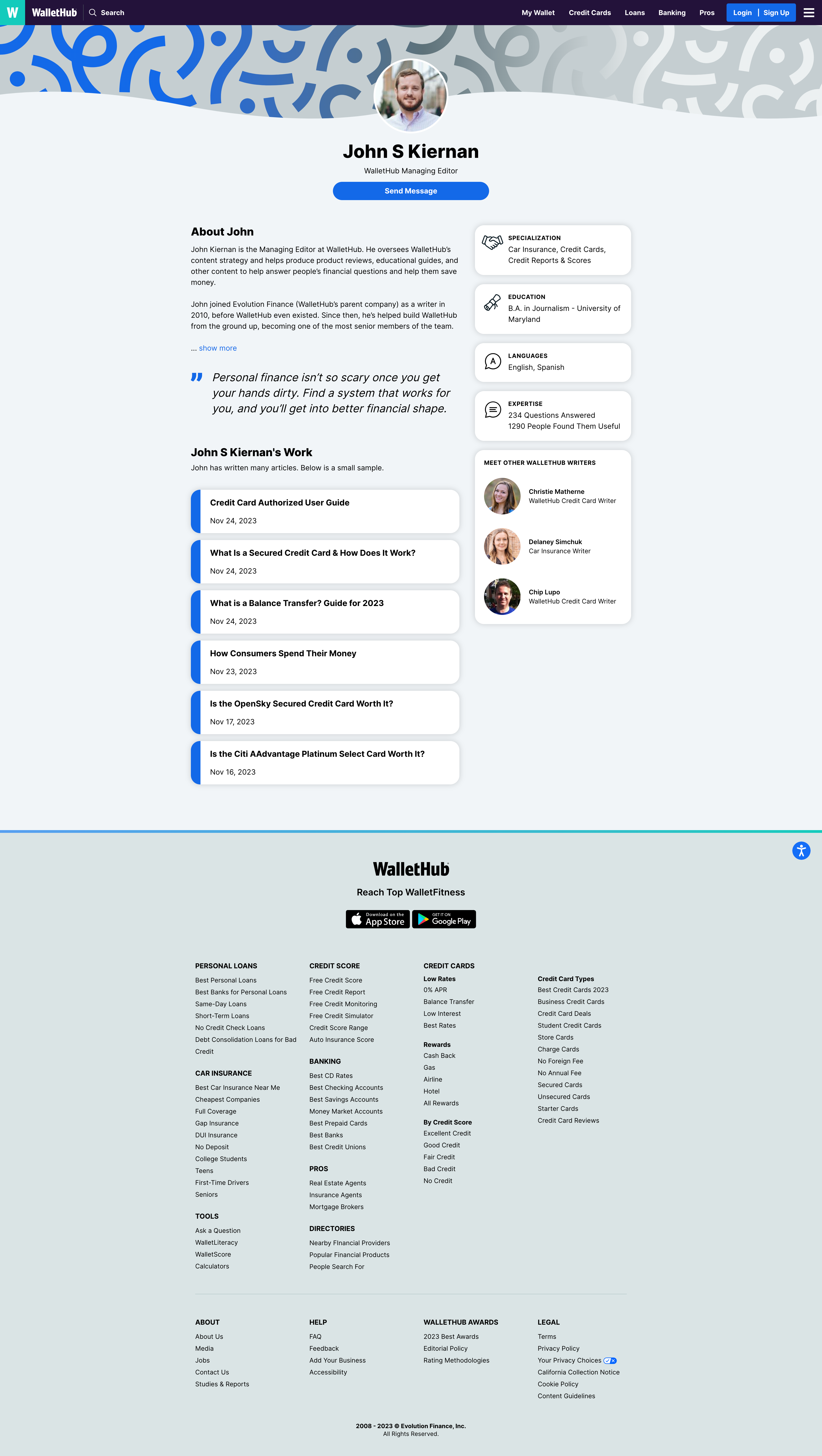
WalletHub’s author pages are simple but effective and are a great example for those wanting to keep theirs relatively lightweight and to the point.
Standout Features of WalletHub’s Author Pages
WalletHub’s author pages, demonstrated here with John S Kiernan’s, showcase how you can show a lot of information about a person without needing to create excessively long pages. Despite being a lot shorter than some of our other examples, these pages still do a great job of demonstrating E-E-A-T.
Key features of WalletHub’s author pages include:
- About the Author: Unlike most, WalletHub’s pages show a comprehensive about the author section but hide a fair bit of this behind a ‘show more’ button. This works well and in my opinion, displays the key information before the expander, helping to keep the page concise.
- An Author Quote: Something that’s not seen on many author pages but that does a great job of adding that personal touch is the inclusion of a quote from the author. This, above anything else, starts to build your trust in the authors, helping you to see their thoughts on a key topic.
- A Unique Way to Demonstrate Expertise: What works really well here is how WalletHub demonstrates its authors’ expertise. Rather than just listing areas of expertise, they showcase how many questions the author has answered on the site and how many people found these useful.
- A Selection of Posts: Whilst many sites show every article that an author has written on a site, WalletHub has chosen to show only a selection of these. But, all of these are recent and show the author’s comprehensive coverage on key topics. In my opinion, there’s no downside to this.
Verywell Fit
Verywell Fit’s organic rankings drive more than 6.5 million monthly visitors in the incredibly competitive health and fitness space, and their efforts to demonstrate E-E-A-T as a publisher can give us lots of inspiration to work into our own sites.
Standout Features of Verywell Fit’s Author Pages
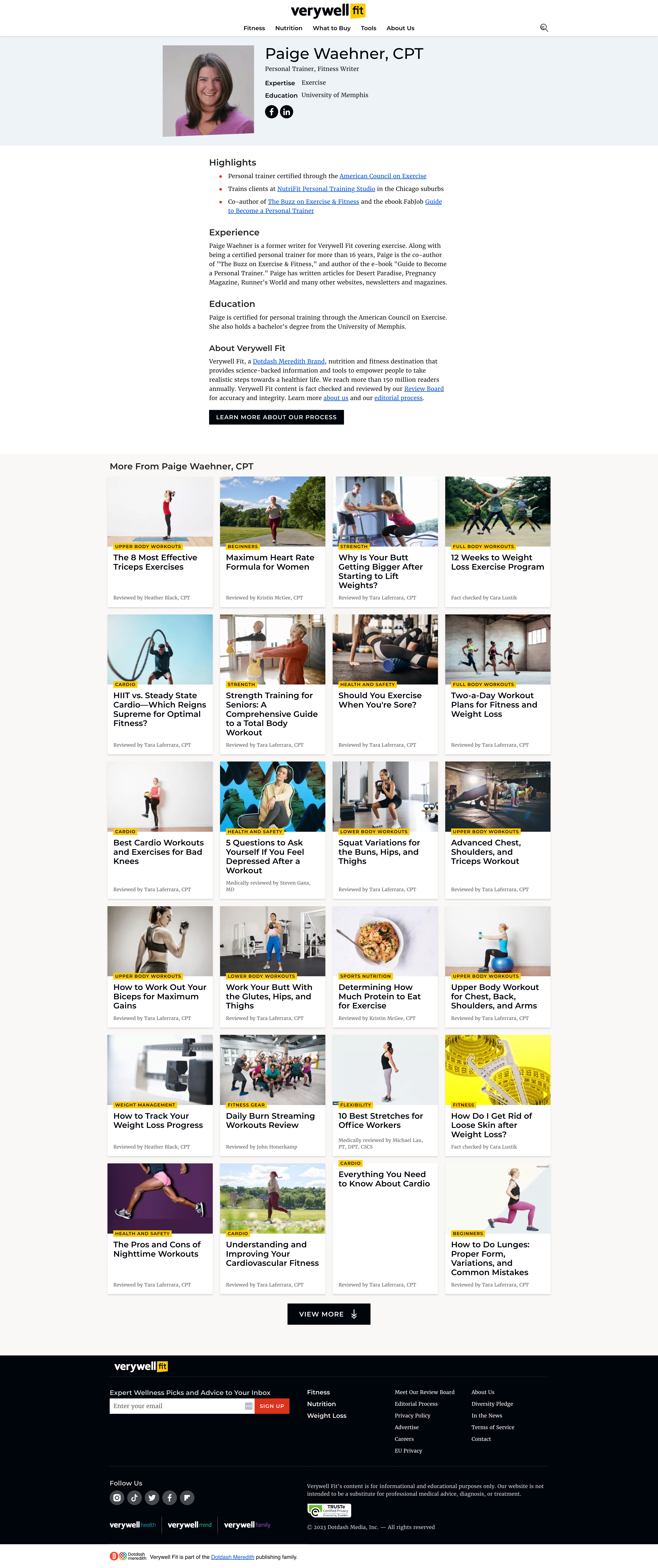
Verywell Fit’s author pages, shown here using Paige Waehner’s profile, showcase a number of ways to help Google to ‘connect the dots’ via author pages, demonstrating the use of third-party references.
Key features of Verywell Fit’s author pages include:
- Highlights: Opening with the author’s highlights is, in my opinion, a fantastic inclusion and one we don’t see used anywhere near enough. Each of these highlights backs up what’s being said with a link to an external source, strengthening the validity of this. In just three bullet points here, we can see the author’s accreditations, real-life experience and published works as an author.
- Experience & Education: Verywell Fit’s experience and education sections aren’t necessarily anything different to what most should be doing, but that’s kind of the whole point. They’re a great example of concisely backing up the experience and expertise that an author has.
Bankrate
Bankrate is widely regarded as one of the US’ biggest sites for financial advice and guidance, and there’s no doubt that they’ve invested a lot of resources in staying ahead of others in recent years.
And their author pages are one I think you’ll want to bookmark for your own inspiration, giving us a great example of how to profile authors in the YMYL space.
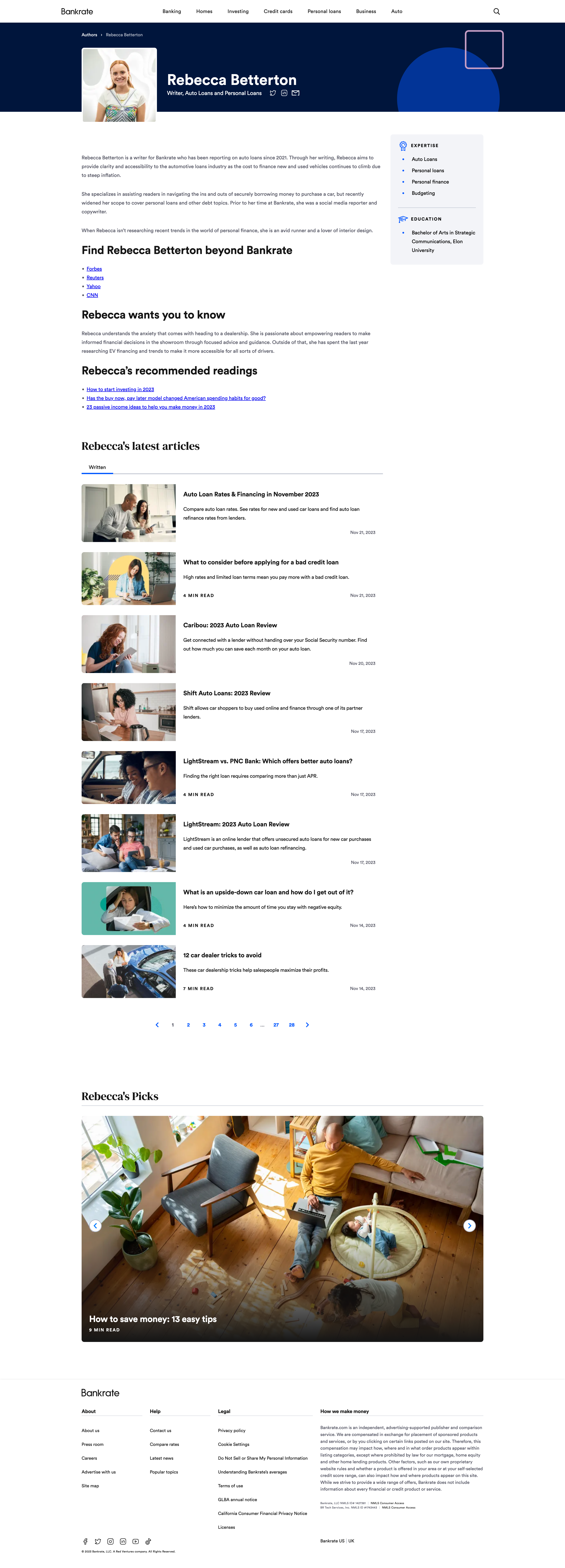
Standout Features of Bankrate’s Author Pages
Author pages have the ability to significantly demonstrate E-E-A-T signals, and Bankrate’s do a great job of this.
Key features of Bankrate’s author pages include:
- Expertise Hooked to the Site’s Focus Areas: You’ll notice, down the right-hand side, that the author’s expertise is clearly hooked to the site’s key focus areas. By keeping expertise simple, rather than a long editorial, it makes it really easy to understand the areas they’re an expert in.
- Recommended Readings: By including the author’s recommended readings on the site, it’s showcasing their stance on what they class as other great content on the site. These are posts by other authors, but it fits really well and help to cross-reference other content.
- Beyond Bankrate: One of the most important things when it comes to E-E-A-T is connecting the dots, and by including this ‘beyond bankrate’ section, is a great way to link out to other authoritative places across the web where the author has been featured.
LloydsPharmacy Online Doctor
It’s no surprise that many of the examples we see of great author pages come from the YMYL space, but it’s interesting to take a look at how eCommerce retailers handle E-E-A-T via their author pages, given that many of our examples so far have been publishers.
LloydsPharmacy Online Doctor has, in my opinion, some of the best author pages in their space, despite these being a hybrid between meet the team and author pages. They’re a great example of how you can use author pages for this purpose when thought out properly.
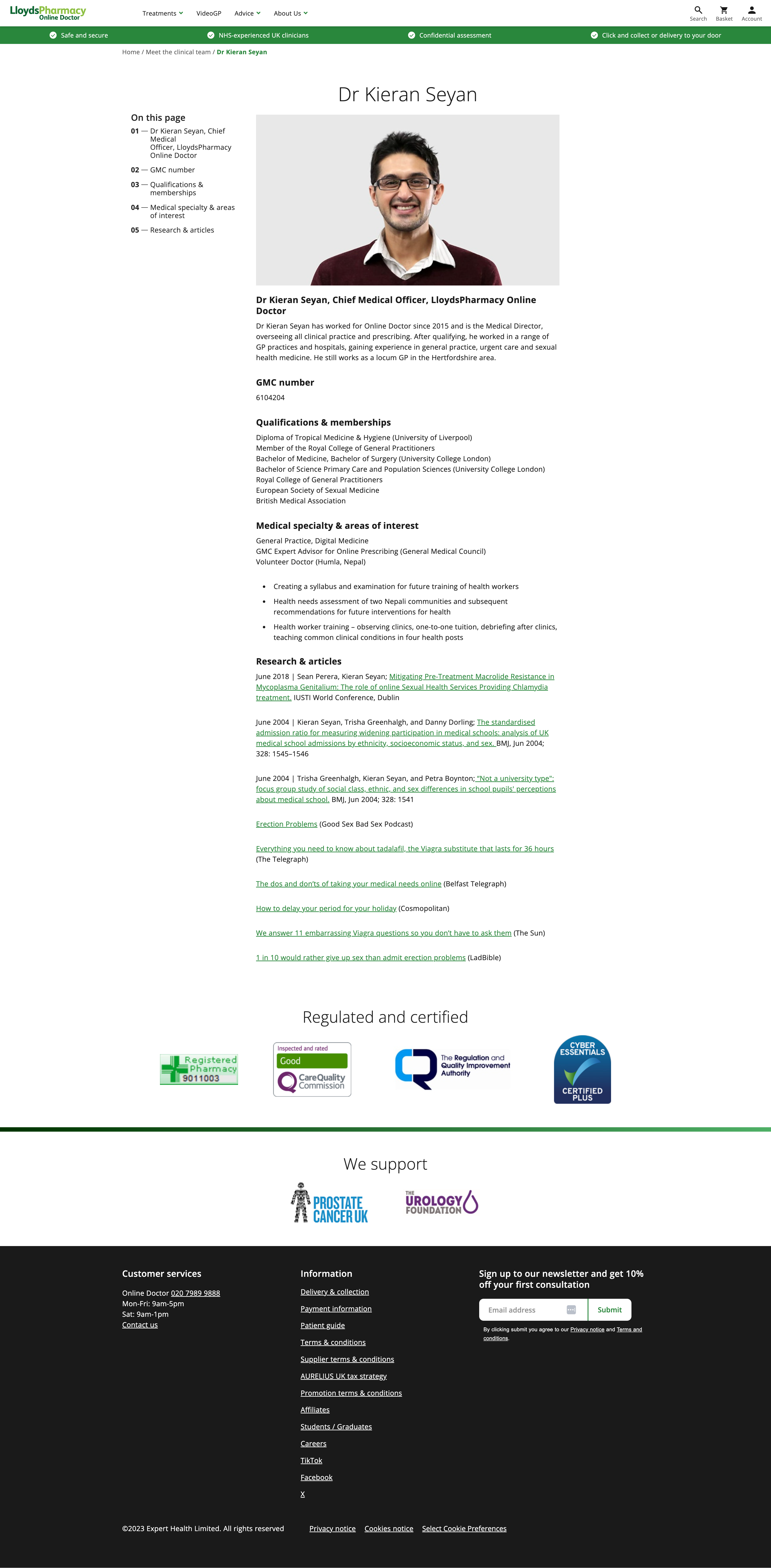
Standout Features of Lloyd’s Pharmacy Online Doctor’s Author Pages
LloydsPharmacy Online Doctor’s author pages, as seen here on Dr. Kieran Seyan’s profile, are another example of an inspirational author page that brilliantly demonstrates E-E-A-T fundamentals.
Key features of these author pages include:
- Professional Role and Experience: The author page begins with a clear statement of Dr. Seyan’s current role as Chief Medical Officer and his medical directorship, overseeing clinical practice and prescribing. It also notes his extensive experience in general practice, urgent care, and sexual health medicine, highlighting his active role as a locum GP.
- Educational and Professional Qualifications: Dr. Seyan’s page lists his qualifications, including a Diploma of Tropical Medicine & Hygiene and degrees from University College London. It also mentions his membership in prestigious medical associations like the Royal College of General Practitioners and the European Society of Sexual Medicine, underlining his academic and professional credentials.
- Speciality and Interests: The author page details Dr. Seyan’s medical specialities and areas of interest, such as General Practice and Digital Medicine. It also sheds light on his contributions as a GMC Expert Advisor and his voluntary work in Nepal, showcasing his diverse interests and commitment to healthcare.
- Research and Publications: The page features a section dedicated to Dr. Seyan’s research and articles, including works published in respected journals like BMJ and contributions to international conferences. This section not only highlights his research skills but also his engagement with the wider medical community.
- Media Appearances and Contributions: Dr. Seyan’s author page lists his appearances and contributions to various media outlets, ranging from podcasts to articles in well-known publications like The Telegraph and Cosmopolitan. This aspect of the page demonstrates his ability to communicate medical knowledge to a broader audience, enhancing his authority and public outreach.
What this site’s author pages don’t do is show a grid of posts authored or reviewed by the GP, nor are there any links to their socials or contact details, but they’re about the only recommendations I’d make to improve these.
These elements combined make Dr. Kieran Seyan’s author page on LloydsPharmacy Online Doctor not just informative but also a testament to his expertise, authority, and trustworthiness, effectively showcasing the necessary E-E-A-T principles.
GoCompare
GoCompare is one of the UK’s leading comparison sites, and its author pages offer something a little different to most.
In fact, they’re a long way from what most sites are doing, but looking at their rankings and visibility, are clearly working to help the site demonstrate E-E-A-T.
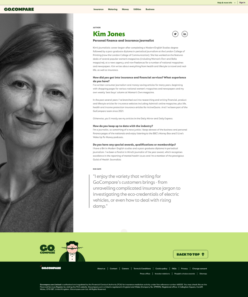
Standout Features of GoCompare’s Author Pages
GoCompare’s author pages aren’t what you’d expect to see from a financial site, but maybe that’s why they work so well?
Key features of GoCompare’s author pages include:
- A Q&A Style Author Bio: GoCompare’s author pages use a very effective Question and Answer style format to really dig into the author’s experience and expertise, and in my opinion, it works really, really well. It’s almost a mini-interview about their background, and it makes it way more engaging to read. Often, bios can read a little robotic, for the simple reason that everyone finds it hard to write about themselves in that way. But a Q&A style feels a lot more natural, and engages the reader, too, whilst getting across the same information.
- The Use of First Person: As a byproduct of being put together in a Q&A format, the use of first person is brilliant and really helps to get the author’s background across in their own words.
- Author Quotes: Quotes from the author, as we also saw on WalletHub’s pages, are so effective at getting across a key message. They still seem to be so rarely used, but when it comes to authenticity and profiling why people should trust an author, they’re something that should be seen more.
Credible
Here’s another YMYL / finance example, again from a site that has understood the importance of keeping author pages concise and to-the-point, whilst focusing on the things that ultimately demonstrate E-E-A-T.
Credible’s author pages are a great example of a page that’s easy to replicate, whilst still being impactful.
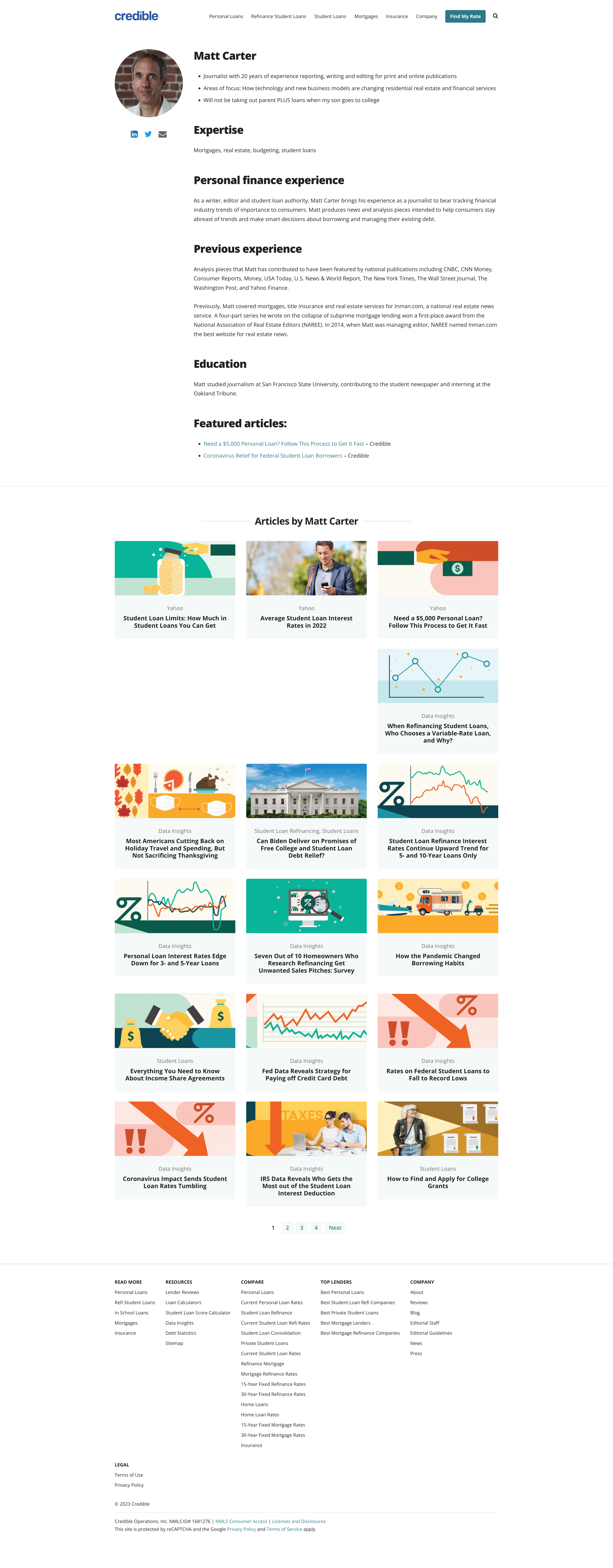
Standout Features of Credible’s Author Pages
Credible’s author pages, as shown here with Matt Carter’s profile, demonstrate a strong understanding to E-E-A-T principles.
Key features of these pages include:
- Extensive Experience: The page introduces Matt Carter as a journalist with 20 years of experience in both print and online publications, instantly establishing his long-term expertise in the field. This experience lends credibility to his insights and analysis in the personal finance space.
- Focused Areas of Expertise: Matt’s areas of expertise are clearly outlined, including mortgages, real estate, budgeting, and student loans. This specificity helps readers understand his particular strengths and the scope of his knowledge in the financial sector.
- Personal Finance Experience: The page highlights Matt’s role in tracking financial industry trends and producing news and analysis pieces. His work is geared towards helping consumers stay informed and make smart financial decisions, underlining his commitment to consumer education.
- Previous Experience and Recognitions: Matt’s previous contributions have been featured in national publications like CNBC, CNN Money, and The New York Times, and it’s great to see this referenced. His past coverage of mortgages, title insurance, and real estate services for Inman.com, including a highly acclaimed series on subprime mortgage lending, showcases his authority and excellence in financial journalism.
- Educational Background: Matt’s educational journey, including his study of journalism at San Francisco State University and early contributions to the student newspaper, is detailed, further backing up his expertise and experience.
- Recent Posts: Including recent posts offers readers quick access to his recent work whilst further illustrating his wide coverage of complex financial topics.
These standout features come together to make Matt Carter’s author page on Credible not just informative but comprehensive, effectively demonstrating his expertise, authority, and trustworthiness in the field of personal finance.
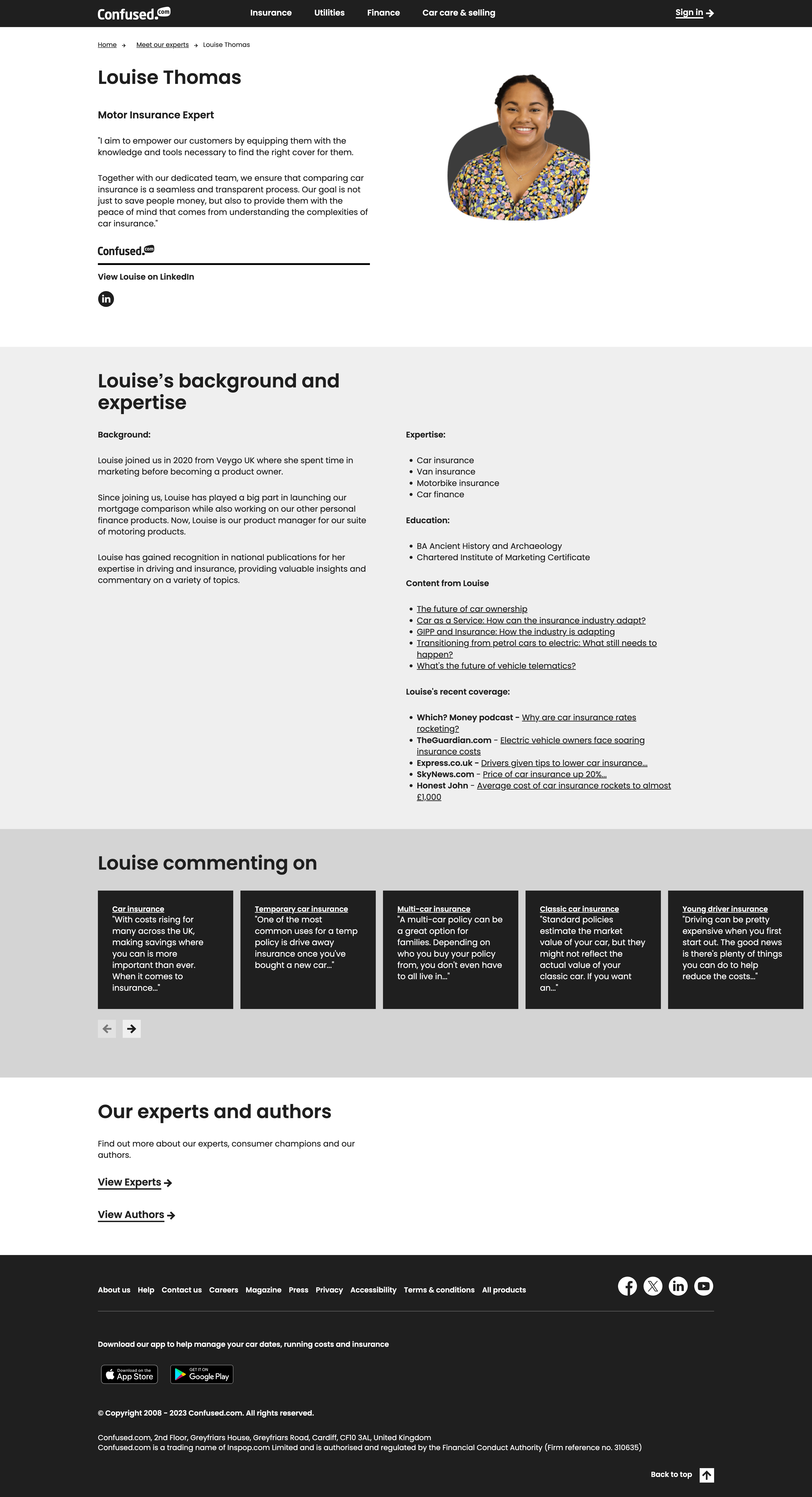
Confused.com
Confused.com are a brand that I recently featured in my roundup of awesome about us page examples, so it’s no surprise to see them featured here, too.
One of the UK’s leading financial comparison sites, Confused.com’s dedication to demonstrating a very high level of E-E-A-T is paying off.
Standout Features of Confused.com’s Author Pages
I often reference Confused.com’s author pages when making suggestions for other brands to improve theirs. And this is for good reason!
Key features include:
- Professional Focus & Mission: There’s no doubt here what the author’s specialist are of professional focus is. But understanding the author’s mission is also key, and, Louise Thomas, identified here as a Motor Insurance Expert, articulates her aim to empower customers with knowledge and tools to find the right insurance cover. This opening statement establishes her commitment to making car insurance a seamless and transparent process, highlighting her customer-centric approach.
- Career Background & Progression: The page details Louise’s professional journey, starting from her time at Veygo UK on their marketing team before becoming a product owner. It also describes her significant role in launching the mortgage comparison feature and managing a suite of motoring products at Confused.com. This narrative demonstrates her expertise and versatility within the insurance and finance industry.
- Areas of Expertise: Specific areas of expertise are listed, including car insurance, van insurance, motorbike insurance, and car finance. This section highlights her specialised knowledge in various aspects of motor insurance, adding depth to her profile and building trust.
- Content Contributions: The author page showcases Louise’s content contributions to the site, featuring articles on topics like the future of car ownership and the transition from petrol cars to electric vehicles. These articles reflect her thought leadership and ability to address current and relevant topics in the insurance industry, as well as making it easy to connect the dots with her other content.
- Media Recognition and Coverage: Louise’s recognition in national publications and her contributions to media outlets like The Guardian and Sky News are highlighted. This aspect of her profile emphasises her authority in the field, showcasing her role in providing insights and commentary on a variety of insurance-related topics.
These features combined make Louise Thomas’s author page on Confused.com not just informative, but also a testament to her expertise, authority, and trustworthiness in the field of motor insurance, displaying a level of effort that goes beyond what most sites do.
Search Engine Journal
I’m pretty sure everyone reading this reads SEJ on a regular basis, but have you ever taken the time to look at how their author pages are structured?
They’re good.
In fact, they’re very good! Especially when it comes to demonstrating E-E-A-T.

Standout Features of Search Engine Journal’s Author Pages
Maybe it’s no surprise that a publication in the SEO industry ticks all the boxes when it comes to author pages, but they’re an example that we just can’t ignore, as far as I’m concerned.
Key features include:
- Job Title & Tenure: The page introduces Matt as the Senior News Writer, highlighting his long-term association with Search Engine Journal since 2013. This establishes his expertise, experience and dedication to the field.
- Educational Background: His educational qualifications, including a bachelor’s degree in communications from Laurentian University, are clearly mentioned, reinforcing his proficiency in journalism and content creation.
- Expertise in Specialist Areas of SEO: The page outlines his areas of expertise, including international SEO, local search, mobile SEO, technical SEO, and content marketing. This detailed breakdown showcases his comprehensive knowledge of various facets of SEO and digital marketing. This is so simple, but such an effective way to show the topic an author is an expert in.
- Recent Posts: Matt’s author page lists recent posts he has written, making it really to associate individual pieces of content with his profile. This not only demonstrates his active role in producing content but also provides insights into the topics he covers and the recency of this.
- Social Profiles & Contact Information: The page includes links to his social media profiles and contact information, encouraging engagement and offering readers additional ways to connect with him and follow his work. Again, this is all about transparency; something that very much goes hand-in-hand with E-E-A-T.
Investopedia
Investopedia is another site that I think every SEO has spent time analysing at some point, and they’re often seen as the gold standard for many tactics when it comes to putting in the effort and going the extra mile.
And their author pages are no different.
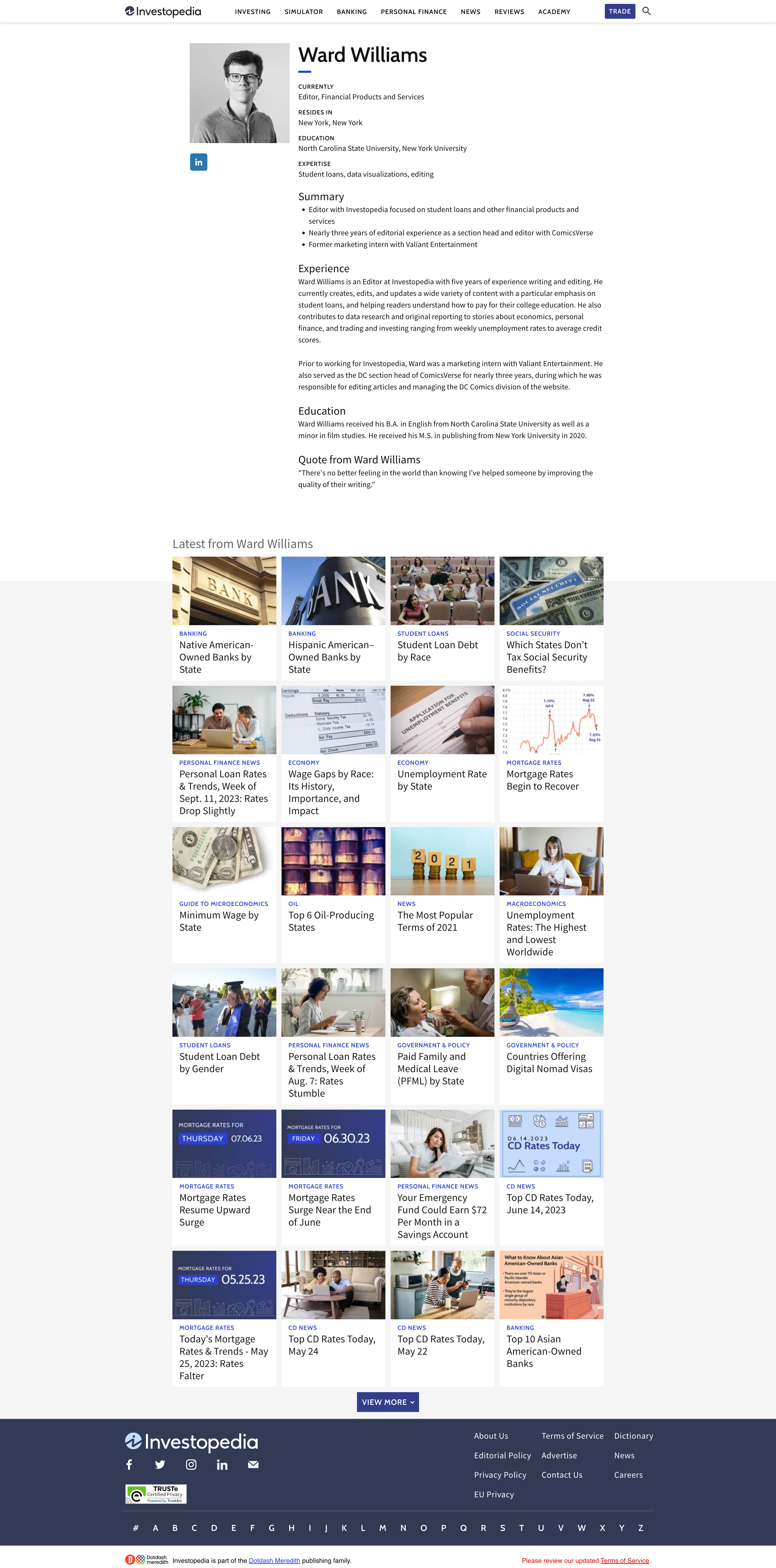
Standout Features of Investopedia’s Author Pages
We know that there’s a requirement for finance / YMYL site’s E-E-A-T efforts to go above and beyond what some sectors do, but once again, Investopedia strike that balance of depth and simplicity really well.
Key features of Investopedia’s author pages include:
- Simple & Concise Information: The opening section of these pages is simple yet gets across the information that’s needed. Adding little touches like ‘resides in’ really helps to build a picture of who these people are, as well as their backgrounds.
- A Summary: Another really effective feature here is the way Investopedia uses the summary section to quickly give an overview as to who the author is. No one ever said author pages and bios need to be lengthy, they just need to get across the right information.
Retro Dodo
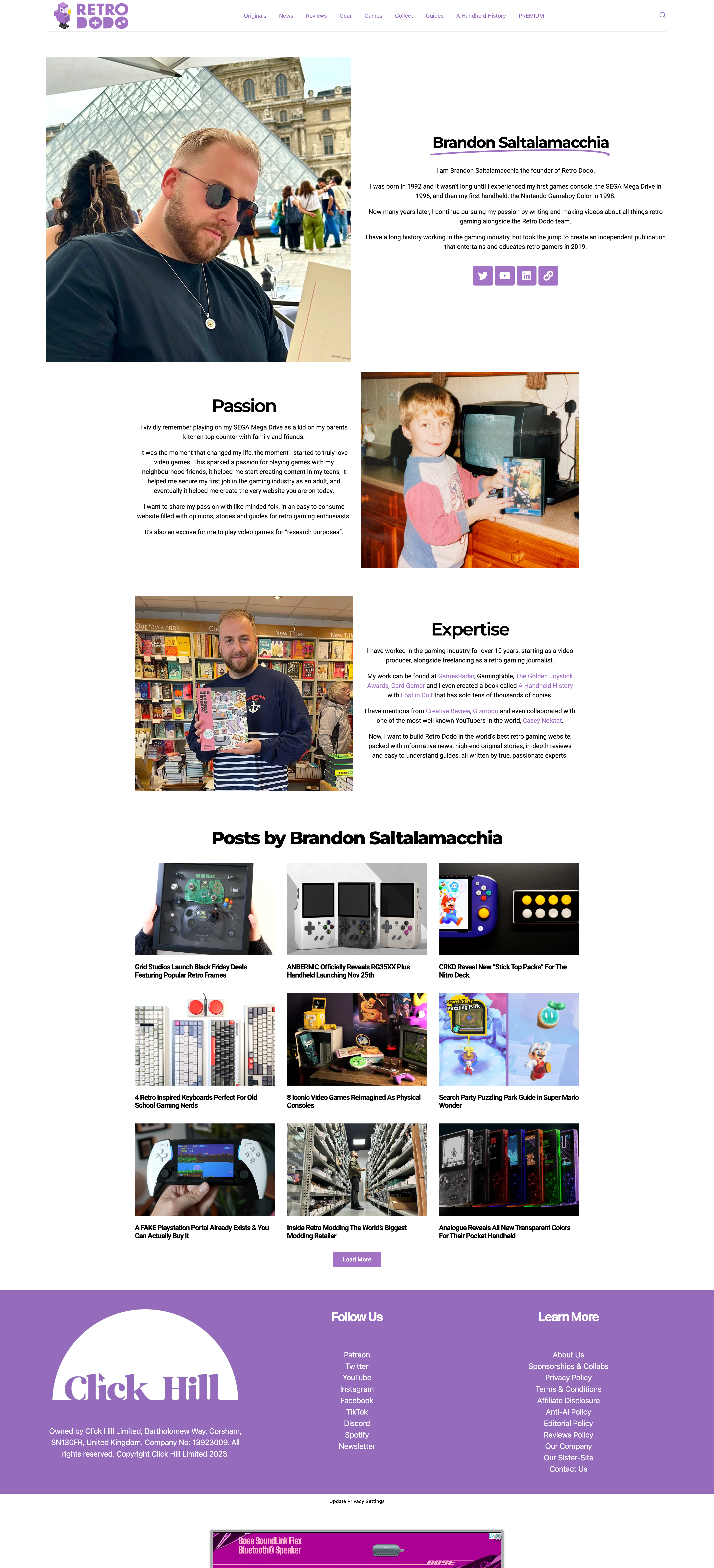
Perhaps the most niche site included here, and likely the smallest too (in terms of wider brand recognition), Retro Dodo has put an incredible amount of effort into its author page, which reads somewhat more like a story than a typical bio.
Standout Features of Retro Dodo’s Author Pages
Retro Dodo’s author pages, shown here for Brandon Saltalamacchia’s profile, showcase an excellent understanding and application of E-E-A-T principles.
Key features of this site’s author pages include:
- Sharing a Personal & Professional Journey: These author pages start with a personal narrative, describing, in this case, Brandon’s early experiences with gaming consoles and his journey to founding Retro Dodo. This narrative establishes a connection with the audience by sharing a relatable passion for retro gaming and demonstrating his long-standing involvement in the gaming industry. In other words, showcasing experience AND expertise.
- An Insight into a Passion for Gaming: Brandon shares his lifelong love for video games, which began in childhood and influenced his career path. This passion is a critical element of the page, showcasing again a genuine enthusiasm and expertise in the field of retro gaming.
- Industry Experience & Contributions: The page highlights Brandon’s more than a decade of experience in the gaming industry, including roles as a video producer and retro gaming journalist. It also showcases his contributions to various platforms and projects, such as GamesRadar, GamingBible, and his book, “A Handheld History,” indicating his wide recognition in the gaming community. These all combine to suggest Brandon’s pretty authoritative in his space.
- Press Collaborations & Mentions: Brandon’s work has garnered attention from popular media publications, as well as having undertaken collaborations with well-known YouTubers, such as Casey Neistat. These links further establish his authority and influence in the field.
- Recent Posts: These author pages includes a list of the author’s posts, offering readers easy access to their wider work on Retro Dodo. This collection demonstrates, in this case, Brandon’s expertise and dedication to providing in-depth, informative content about retro gaming. Make it easy for users and search engines to find other content authored by the writer.
These elements collectively make Retro Dodo’s author pages not just informative, but also a compelling story of passion turned profession, effectively demonstrating E-E-A-T principles.
It’s not always about formal education, and this is the perfect example of an author page that, above anything else, just feels SO genuine.
Author Pages; an Important Part of Demonstrating E-E-A-T
If your author pages aren’t as good as these examples, then now is the time to do something about it.
There’s stacks of evidence that suggests Google is continuing to double down on understanding who authors are and what their experience and expertise is, and from an on-page perspective, author pages are your best way to demonstrate this.
Don’t get left feeling defE-E-A-Ted by author pages and showing Google the right trust signals. Digitaloft is a specialist SEO agency with over a decade of experience supporting brands with targeted organic growth strategies. Speak to our team of experts for tailored insights on how we could help your business win by owning the search moments that matter to you.


