Last updated: 24th Apr 2026
The expert guide to 404 pages: Tips and examples to inspire your website.
 By Ellie Wraith, Head of Search
Get weekly SEO insights straight to your inbox.
Sign up to outranked, our weekly SEO newsletter
Website owners, listen up. You might think that building a great 404 page isn’t worth your time, resources or effort. But you’re wrong.
Sure, 404 pages aren’t going to boost your website’s ranking in search engine results directly, but they can play a mission-critical role in keeping users on your site and your brand in their good books.
Whether you’re a business owner, marketing professional, independent blogger or someone working agency-side to provide website management services, I’ve written this guide especially for you (you’re welcome).
What is a 404 page?
A 404 page (sometimes known as a 404 not found page) is a web page that a web server displays when a user attempts to reach a particular URL that doesn’t exist or when it can’t find a requested page.
The 404 error code is one of many standard error messages in the HTTP status code system, where the number indicates the specific issue.
A site’s 404 page is somewhat unique in that the website owner generally hopes their users never see it! But, as we know, life is messy, and things inevitably go wrong, so it pays to be prepared with a top-tier 404 error page just in case.
Common reasons why users end up on a 404 error page
There are several reasons why visitors land on your website’s 404 page. Generally, unless someone is deliberately seeking them out to use as examples in an all-singing-all-dancing ultimate guide to error pages, it happens accidentally.
Making a typo in a URL
Human error is one of the main reasons why visitors might end up on your 404 page. Unfortunately, it’s also the reason that’s entirely out of your control. Sorry.
If a user types the wrong address into the search bar, your web server won’t be able to return the specific page they were hoping to reach because it simply doesn’t exist.
Clicking on a broken link
Much like Ross and Rachel, links can take a break* from time to time. Both internal and external links can stop working for a variety of reasons, especially when you change URLs or delete pages without updating the links.
*Luckily for us, though, fixing broken links doesn’t typically require writing an 18-page letter, front and back. You can find and fix broken links using tools like Screaming Frog, Semrush and Ahrefs.
Trying to reach a page that no longer exists
If your site visitors try to access a non-existent page (maybe a seasonal campaign page you deleted once it was no longer needed), your web server should display a 404 error message to notify them and redirect them.
Why are 404 pages important for websites?
Picture this. You’re 5 years old again, shopping in Tesco* with your mum. You stop to look at the comic books, turn around, and mother dear is nowhere to be seen. You spiralled into a blind panic, and a future life as a street urchin flashed before your eyes, right?
Nobody likes feeling lost.
First and foremost, 404 pages exist to help lost visitors retrace their steps (or, in this case, clicks) back to the site’s homepage or to an alternative page where they can find the information they’re searching for.
The function and importance of a 404 page go well beyond this, though, providing a website with countless other benefits. Let’s take a look at some of these in a little more detail.
*Other supermarkets are available, and this post is in no way sponsored by Tesco (we wish). If anyone senior at Tesco is reading this guide, your organic traffic has been on a downward trajectory since September 2022, and your 404 page could do with a lick of paint. Get in touch to see how we’d work to turn it around.
1. Manage user frustrations
If you’re driving down the road and suddenly hit an unexpected dead end, it’s annoying AF. You want to reach your destination quickly and without stress. You don’t want to make 5-point turns to get out of a cul-de-sac.
Well, the same goes for websites and their users. People just want to easily navigate to a particular page, so hitting non-existent or broken URLs can lead to a seriously frustrating experience.
This frustration can turn into resentment towards your brand and its online presence, prompting visitors to choose competitor websites in the future. Now, I’m no mind reader, but I’d bet that’s not what you want.
2. Redirect users back to your site
Whether it’s back to the homepage or elsewhere, you want to keep users on your site rather than push them to think, “Screw this!” and leave.
In the context of eCommerce and even omnichannel businesses, this is even more important. Users aren’t going to convert if they can’t find the pages that let them compare products, learn about your business and click that all-important “add to basket” button.
3. Boosting customer retention rates
A good site experience* is crucial for retaining customers and building brand loyalty among your target audience. If people find that your website doesn’t load properly or fails to diffuse frustrations when displaying an error message
*This isn’t just hearsay, either. Improving a website’s Core Web Vitals is one of the cornerstones of effective search engine optimisation strategies. You can learn more about the three pillars of SEO in our guide.
The best examples of killer 404 pages
Okay, so we know the what, why and how of 404 pages, but where can we see examples of these principles on the web?
Whether you’re embarking on a full-scale site redesign or simply looking to improve the experience for website visitors landing on your existing 404 page, here’s some inspiration to get those creative juices flowing.
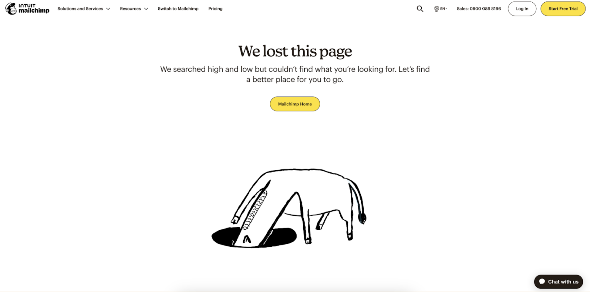
1. Mailchimp
In the eyes of many, the Mailchimp 404 page is the GOAT for clever, tension-diffusing design.
It’s simple yet effective, showing a horse with its head in a hole looking for the page it can’t find. I love how the copy addresses the lost visitors directly and reassures them that they can find their way back to the homepage in just one click.
Top tip for improvement: To keep things even more on brand, replacing the horse with a Monkey would be a nice touch.
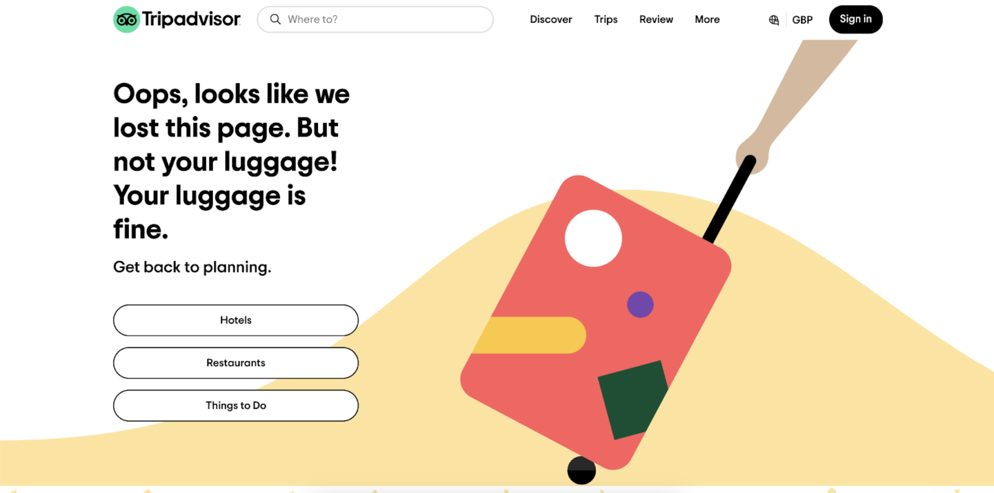
2. Tripadvisor
The copy on Tripadvisor’s 404 page steals the show. Simple but packing a real punch (pun intended), it explains to any users that the page they were looking for is lost…but not their luggage…that’s fine!
I like how Tripadvisor have broken from grammar conventions and achieved an edgy, high-impact tone by using fractured sentences. Plus, in terms of user navigation, this page ticks all the boxes. It has links to the main category landing pages and a search bar that lets visitors move away from the error page towards their dream destination.
Top tip for improvement: It’s not immediately clear that the lost page is a 404 error, so a little detail on the suitcase to that end would aid user comprehension.
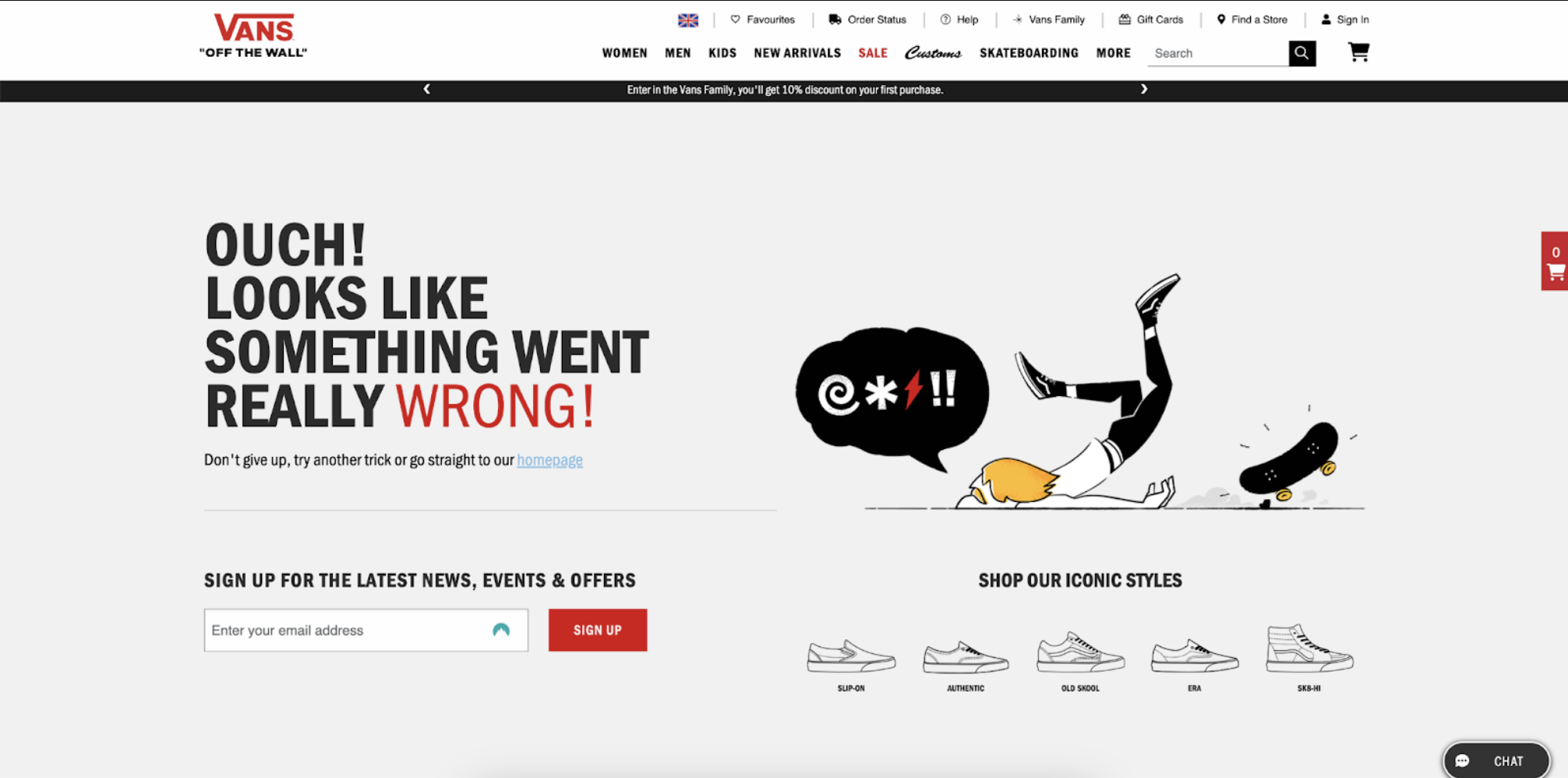
3. Vans
Vans has landed feet first with its 404 page, missing no tricks from top to bottom.
The designers of the webpage have honoured the brand’s identity and the interests of its target audience, making some stellar skateboarding puns and keeping this edgy.
Navigation-wise, this page has all the necessary links. Users can easily return to the homepage, move directly to the brand’s key product ranges by clicking on stylised icons, and even sign up for the Vans email newsletter to receive special offers.
With this page, Vans makes it ultra-easy for users to get off the wrong page and onto one that lets their shopping journey continue.
Top tip for improvement: To add some action to the page, the skateboarder could be animated, failing to land their ollie or kickflip.
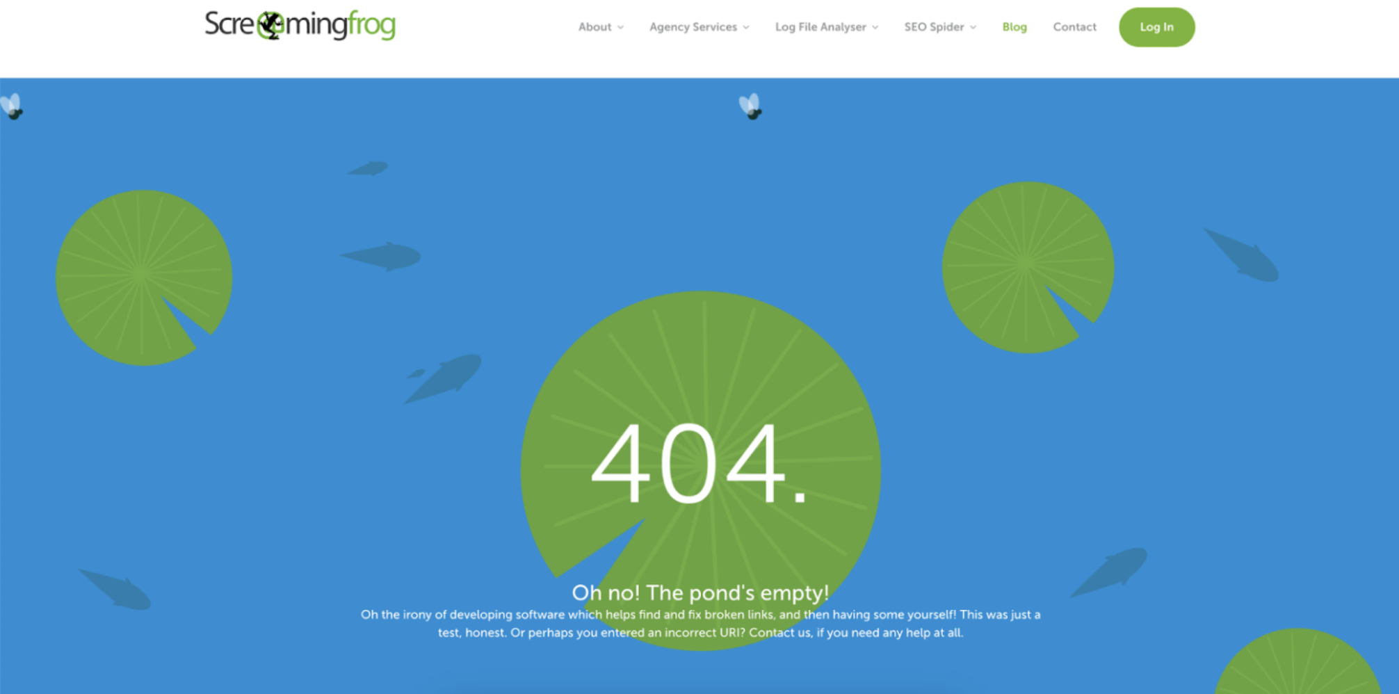
4. Screaming Frog
If you don’t work in SEO, you may have never come across Screaming Frog (don’t worry, no amphibians were harmed in the writing of this blog post).
Screaming Frog is a tool SEOs and website owners use to find and fix broken links, so it’s somewhat ironic to be featuring it in a round-up of the best 404 pages on the web.
This site uses this irony to its advantage, though, acknowledging the humour in failing at the very problem it promises to solve! Alongside the comedy elements, the page design is right on-brand, featuring a pond with lily pads and rippling water. Bonus points for having an animated background, too!
Top tip for improvement: From a UX perspective, the text is a little tricky to read against the blue and green background. Screaming Frog could make its 404 page even better by moving the central lily pad and using a heavier-weight font.
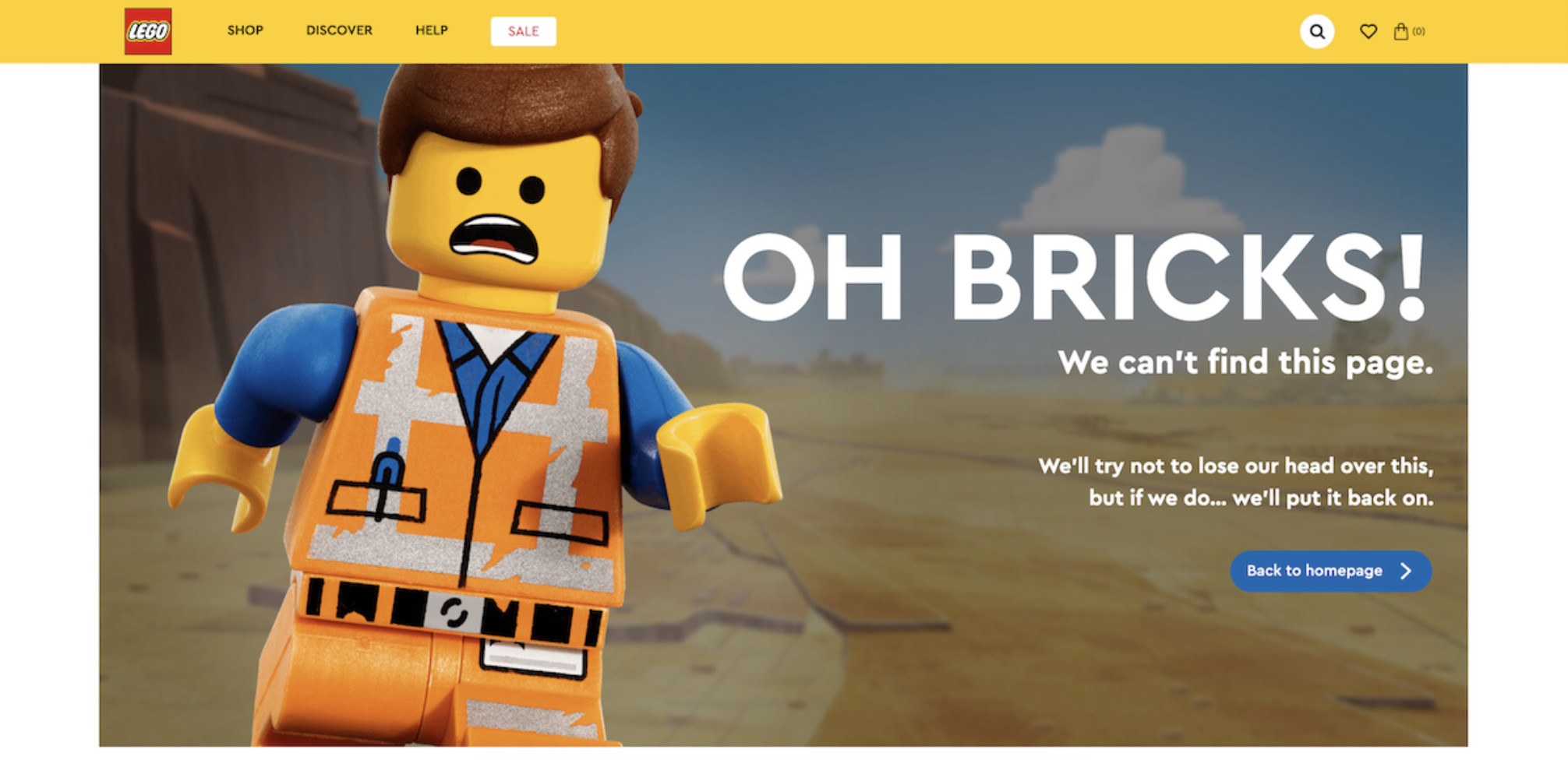
5. Lego
The designers behind the Lego 404 page have really outdone themselves with this one, providing the perfect combination of comedy and brand relevance. It almost feels as if the little construction worker is reaching out of the computer screen!
One of my favourite touches is the copy underneath the title, which reads, “We can’t find this page. We’ll try not to lose our heads over this, but if we do…we’ll put it back on.” Funny, light-hearted, and totally on-brand for Lego.
Top tip for improvement: This is a great page, but it could be taken to another level by including an animated character in homage to the brand’s expansion into cinema. Lego…I want to see that figurine running!
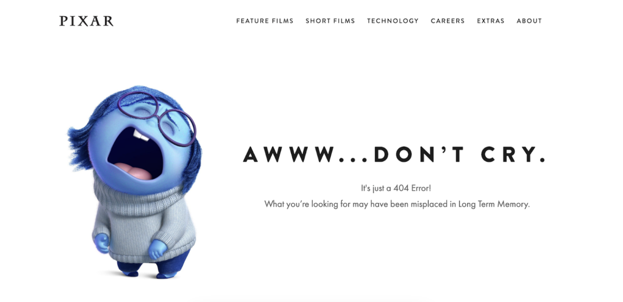
6. Pixar
Similar to Lego, Pixar’s 404 page uses Sadness, a character from the blockbuster movie Inside Out, to play off the idea that a lost visitor may be feeling a little upset after following a dead link.
The page provides the right amount of comic relief without compromising the clarity of the message itself and ensures that the black sans serif text remains ultra-clear against the white background.
Top tip for improvement: There are no links on the page itself, which is a missed opportunity to redirect users back to the website. A button to a key landing page or a search bar would really dry those tears! Also, Pixar could rotate the characters to highlight different movies or promote new releases.
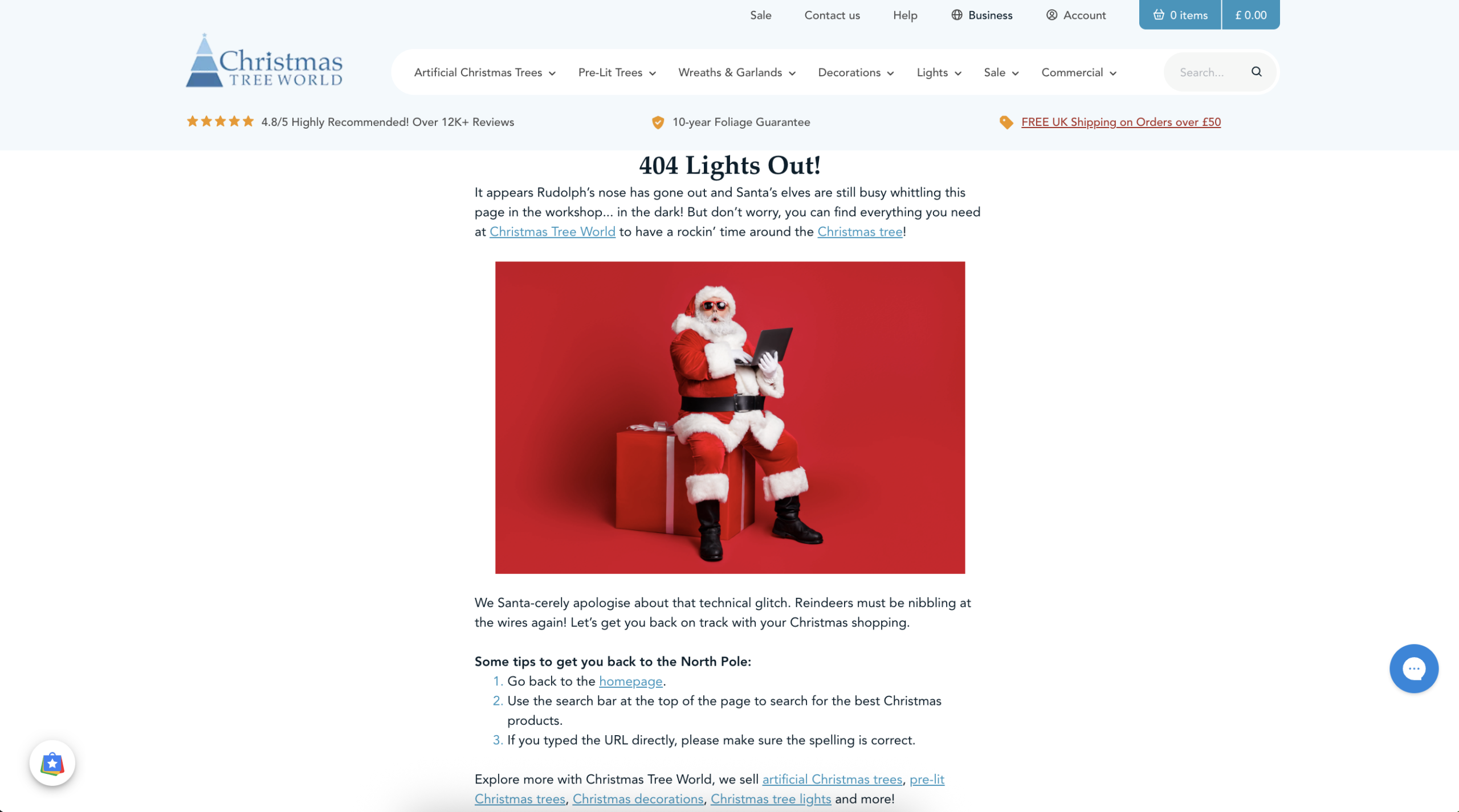
7. Christmas Tree World
Christmas is the most wonderful time of year, apart from when Santa’s sleigh takes you straight to a 404 error page…unless that’s Christmas Tree World‘s 404 page!
The puns, the image, the apologetic yet light-hearted tone of voice, and the links to other pages on the site; everything helps lost visitors return to the North Pole in search of the perfect Christmas decorations.
Top tip for improvement: The text could be slightly larger to improve accessibility…but that’s only if I’m being picky!
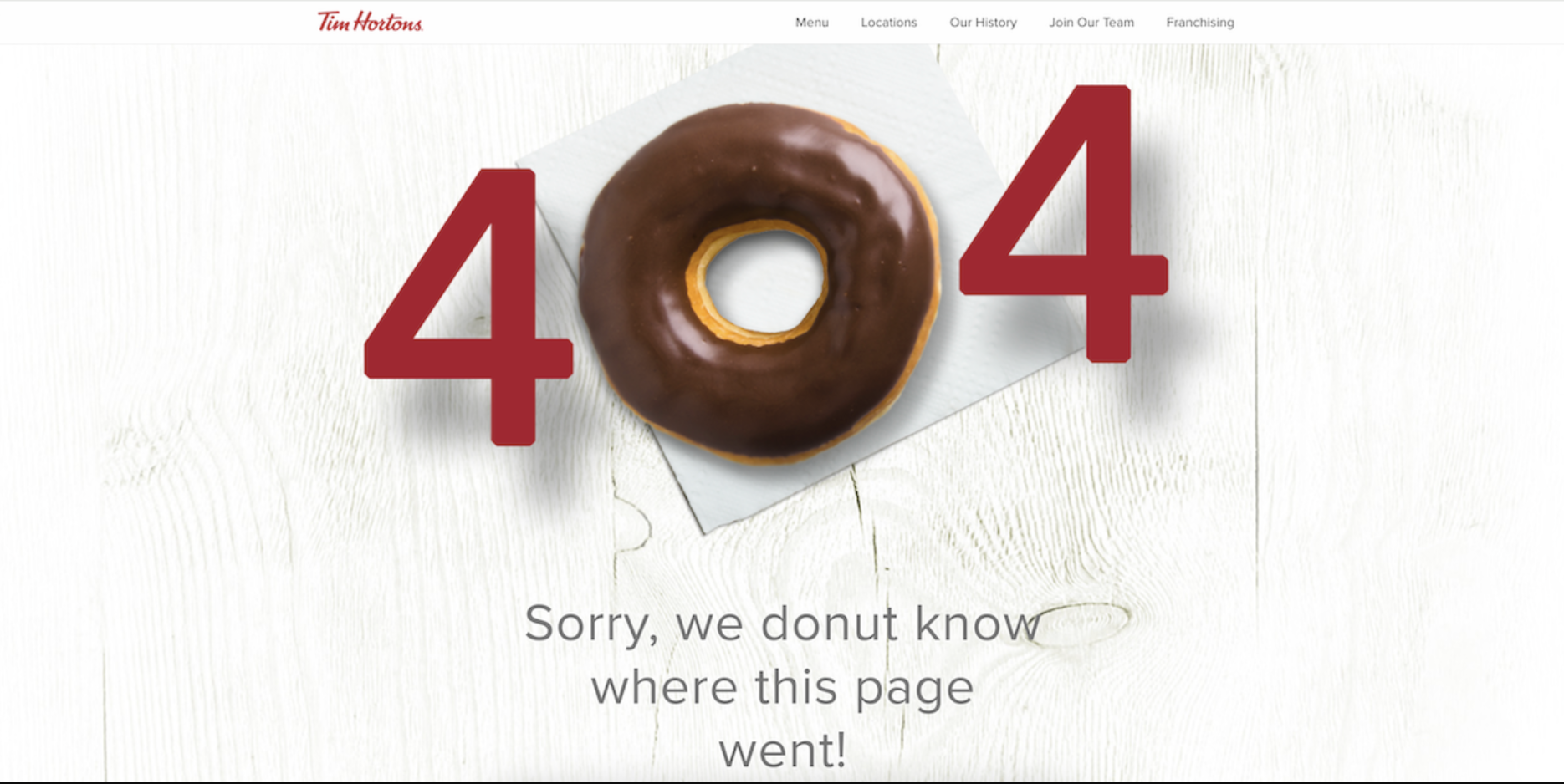
8. Tim Hortons
There’s no doubt what this page is about!
When it comes to clear messages, Tim Hortons is leading the pack(et of doughnuts). The 404 page not found error message is clear as day, and the little added touch of the doughnut for the zero keeps things fun.
Top tip for improvement: Whilst I love the cheeky little pun in the copy underneath the heading, the text itself could contrast better with the white background. Also, a link back to the homepage would help users return to the sweet-smelling, sugar-filled safety of the homepage.
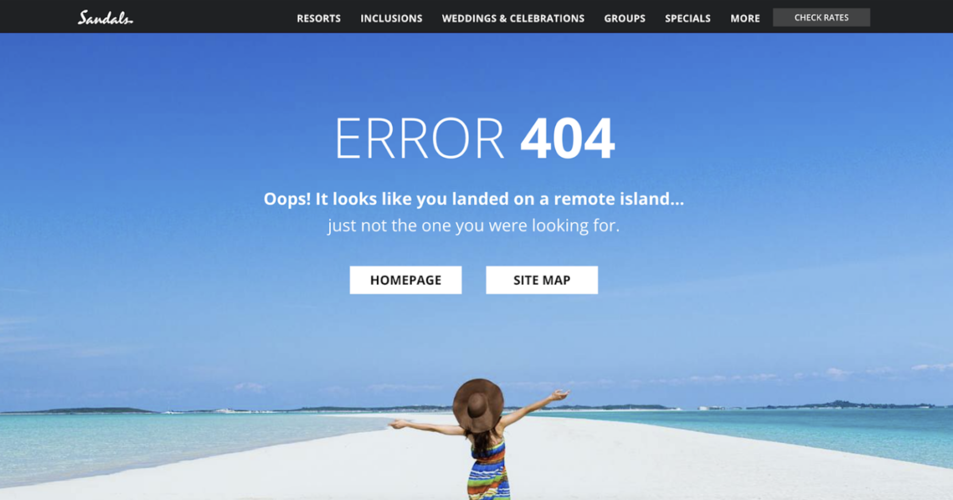
9. Sandals
The second travel brand in the lineup is Sandals.
Like Tripadvisor, Sandals has opted for a fun travel-themed joke to bring some comic relief to its 404 page and diffuse user frustrations. I love how the background image makes you feel instantly relaxed and provides real wanderlust inspiration…it’s almost impossible not to forgive the site’s errors and head back in search of the perfect island escape!
Top tip for improvement: While the link to the sitemap was probably well-intentioned, it might overwhelm users by providing too much information. Don’t fall into the trap of the choice paradox by giving visitors too many options to click on!
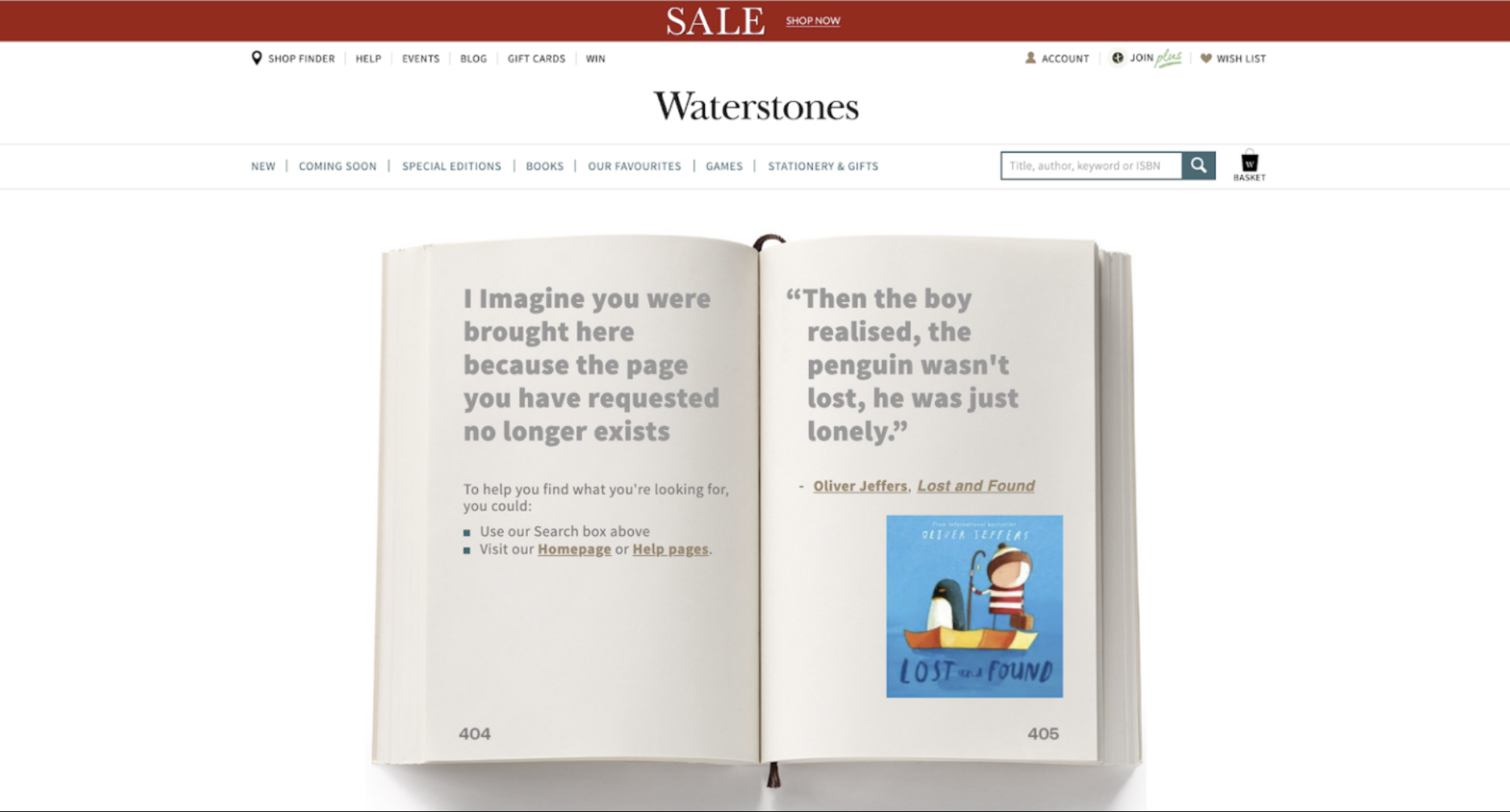
10. Waterstones
If there were a prize for the most wholesome 404 page, Waterstones would win.
The open book with pages numbered 404 and 405 is the perfect nod to the brand’s core product offering and adds a bit of fun to the equation. It’s also lovely how Waterstones’ designers have included quotes from books that relate to being lost or lonely – a lovely way to promote featured titles and create content that resonates with the site’s book-loving visitors.
Top tip for improvement: Even though it might require some development work, an interactive element on this 404 page would take it to new heights. The user could flick through the book’s pages to read more quotes and explore titles, adding unique value and keeping them engaged.
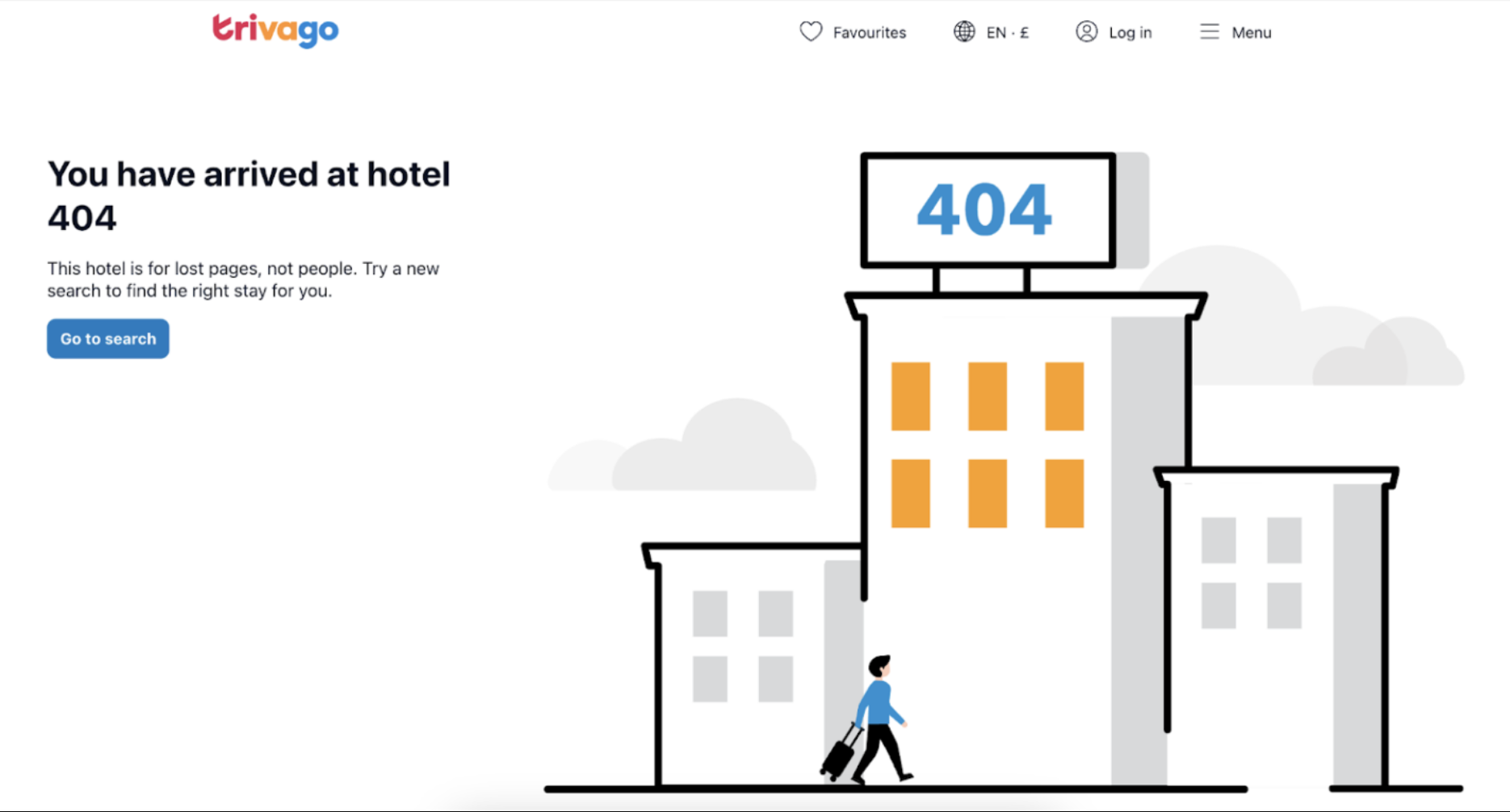
11. Trivago
Last but not least, we have Trivago (yes, another travel brand…these guys just really seem to know their sh*t when it comes to 404 error pages)!
It’s super simple yet super effective. The error message reads, “You have arrived at hotel 404”, with the follow-up of, “This hotel is for lost pages, not people. Try a new search to find the right stay for you.”, providing a clear message that the user isn’t in the right place on the Trivago website.
The text is on-brand, and the search button lets visitors continue their holiday planning journey with a single click.
Top tip for improvement: Trivago could up the fun factor with this page by animating the figure or transforming the hotel graphic into a dilapidated motel with flickering lights. It could also include a chat widget for customer support or links to destination pages that inspire intrepid explorers.
Key components of the best 404 pages
There’s no one-size-fits-all approach to 404 error page design, but certain elements can take your page from zero to hero and help ensure excellent user experiences in spite of the not-so-excellent circumstances.
- A search bar: Don’t make all navigation decisions for your users. Instead, let them choose where to go next by including a search bar.
- Alternative links to other pages: 404 errors don’t need to be dead ends. By including links to other pages on your site, you can make any visits to your 404 page fleeting and ensure that users don’t decide to return to Google in search of your competitors.
- A clear error message: If you know where you are and how to escape, are you really lost? Tell visitors they’ve landed on a missing page and offer a clear solution to set things right.
- Easy access to your site’s header: Preserve as many of your site’s core features as possible, including your header and footer. These will be familiar to the user and help them situate themselves far more easily.
- Contact information – Explain how people can contact your support team, either by listing the details in the footer of your 404 page or providing a link to your dedicated contact page.
- A chat window for customer support: An unessential but nice-to-have feature is a chat box that lets users ask questions or request additional information about your brand.
How to create a killer 404 page
Okay, so these tips really apply to all pages across your entire site…404 error pages included. If you want to create a 404 page that ticks all the boxes, dots all the Is and crosses all the Ts, you need to think holistically.
Think about UX design and usability heuristics
As part of your efforts to diffuse frustration and keep your site visitors on your side, think about the overall UX (user experience) of your 404 page. Ensure the content is accessible, inclusive, and consistent with the rest of your site, and incorporate elements that align with key usability heuristics to make the page easier to process and navigate.
Keep things consistent with your brand identity
Your brand’s personality needs to run through the core of your entire website, including the 404 error page. At a minimum, ensure you uphold your site’s branding, tone of voice, and values so that any lost visitors feel they’re still interacting with you, even when they follow a dead link.
Remember the negativity bias
The importance of managing user frustrations with effective 404 error pages becomes even more acute when we consider one of the key principles of marketing psychology: the negativity bias.
This principle states that, as squishy, emotional human beings, we have a cognitive propensity to dwell more on negative experiences than positive ones. So, when we apply this to websites, users will remember frustrating on-page experiences far more than seamless ones, making it mission-critical that we diffuse any and all tension wherever possible.
Humour might be your new best friend
Some of the best 404 pages use humour to their advantage by poking fun at the fact that they’ve made an error for a bit of light comic relief. If you can turn a negative experience into a positive one by making your users laugh, you’re on to a winner.
Just remember, though, that humour won’t be appropriate for all websites. Generally speaking, people aren’t really in the mood for jokes when filing for bankruptcy or planning a funeral.
Preserve navigation features
You don’t want the 404 page to be the end of your website visitor’s journey, so be sure to make it easy for them to navigate away from the error page and towards another destination. By this, I mean keeping the top navigation bar, hamburger menus, brand logos that link back to your home page, and the search bar (if your website has one) visible on the screen, so users have more ways to return to your site.
Let’s make 404 errors an opportunity to grow
Struggling to retain traffic or facing technical SEO issues?
Digitaloft is a specialist SEO agency with over a decade of experience helping brands achieve targeted organic growth. Speak to our team of experts for tailored insights on how we could help your business win by owning the search moments that matter to you.